Scope and sequence (F–10)
Learning programs to support implementation
Sequenced topics that could be used in teaching the Australian Curriculum Digital Technologies curriculum to address the content descriptions of the curriculum. The Scope and sequence has been updated to support teachers to implement AC:DT V9.0.
Select a topic across a two year cycle
Recommended any combination of three topics per year.
Choose a combination of units that suits your students and context.
Cycle one (Year 9)
Cycle two (Year 10)
Cycle one (Year 9)
| Jan | Jun | Dec | |||||||||
|---|---|---|---|---|---|---|---|---|---|---|---|
Cycle two (Year 10)
| Jan | Jun | Dec | |||||||||
|---|---|---|---|---|---|---|---|---|---|---|---|
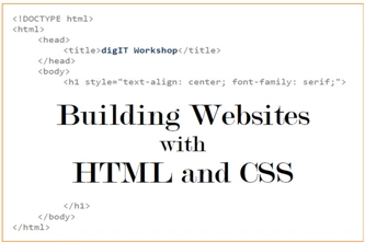
Webpage design
Overview
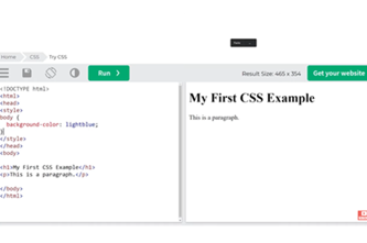
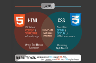
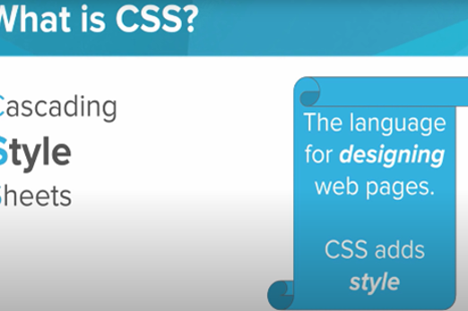
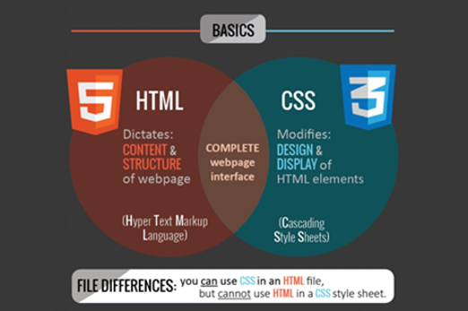
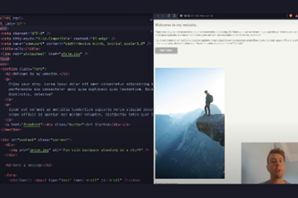
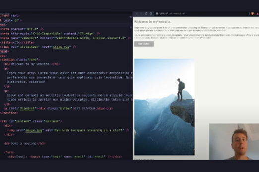
This unit introduces students to key layers of webpage development that represent content, structure and presentation. Students develop simple webpages employing hypertext markup language (HTML) for the structure of webpage content, as well as Cascading Style Sheets (CSS) for styling. They explore aesthetics in modern webpage design, and accessibility for diverse audiences.
Optionally, students learn how to integrate JavaScript programming for more advanced webpage behaviour.
Achievement standards
By the end of Year 10 students develop and modify innovative digital solutions, decompose real-world problems, and critically evaluate alternative solutions against stakeholder elicited user stories. They acquire, interpret and model complex data with databases and represent documents as content, structure and presentation. They use advanced features of digital tools to create interactive content, and to plan, collaborate on and manage agile projects.
Australian Curriculum
Content descriptions
Data representation AC9TDI10K02
Generating and designing AC9TDI10P07, AC9TDI10P05, AC9TDI10P06
Producing and implementing AC9TDI10P09
Collaborating and managing AC9TDI10P11
Related content and General Capabilities
English: Literacy: Creating texts AC9E9LY06, AC9E10LY06
Digital Literacy: Creating and exchanging, Managing and operating
Critical and Creative Thinking
This topic enables students to
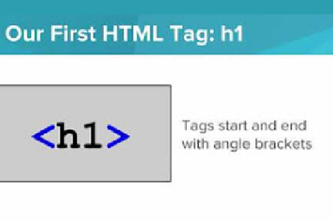
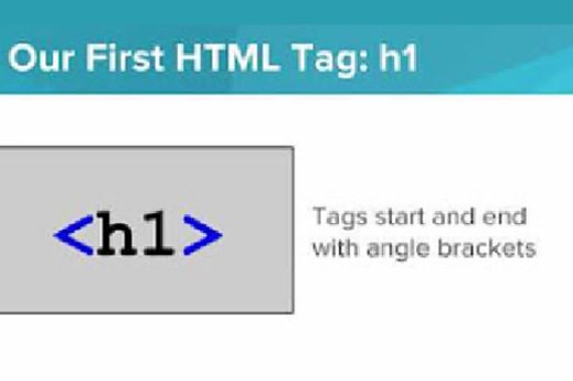
- name and describe the layers of web development and identify components of webpages as belonging to them
- understand how the separation of content, structure and presentation helps create viable webpages
- create simple webpages using basic elements of HTML and CSS
- apply contemporary web development practices for functionality, accessibility, usability and aesthetics
- optionally, apply JavaScript to imbue webpages with useful behaviour.
Supplementary information
HTML and CSS are neither general-purpose programming languages nor object-oriented programming languages.
The optional topic JavaScript in a webpage is recommended for students studying the JavaScript language rather than the Python language, since webpage elements (for example, images, text and links) provide a graphical user interface for JavaScript. However, the JavaScript pathway in the Years 9-10 Programming unit ensures provision of JavaScript programming activities with appropriate complexity.
Watch this video for a quick overview of the unit and how to use its resources with your students.
Assessment View assessment advice
Assessment
A rubric can focus on one specific criterion related to a content description as in this example focusing on students’ knowledge and skills related to webpages and use of CSS. Use this example as a starting point to assess students' knowledge and skills.
A relevant question to pose is ‘Why is content separated from presentation?’
This type of question allows students to draw on their knowledge and understanding and present their ideas using relevant examples.
Achievement standard
Students acquire, interpret and model complex data with databases and represent documents as content, structure and presentation.
Use this resource, Rubric example, for further assessment advice that incorporates elements of design and project management. Modify the example to suit your students and context.
| Webpage design: Separating style from content | with guidance describes the purpose of CSS | describes the purpose of CSS with a relevant example | describes the purpose of CSS with a relevant example and explains how this enhances webpage design | describes the purpose of CSS with a relevant example and explains how this enhances webpage design. Explains how this practice enables efficient updates of content |
| Webpage design: applies knowledge of CSS | with guidance applies CSS styles to a given webpage | applies CSS styles to a given webpage | designs and applies CSS code to their own webpages | applies knowledge of CSS to their own original webpages and demonstrates different designs using identical content |
Unit sequence
This topic offers 3 sequential units and an optional 4th unit
Unit 1
What makes a webpage?
Explore the three layers of web development and introduce the types of coding that underlie hypertext markup language (HTML), Cascading Style Sheets (CSS) and JavaScript.Unit 2
HTML and CSS
Take a deeper dive into how the content, structure and presentation layers are achieved using HTML and CSS.Unit 3
Designing a webpage for everyone
Explore simple accessibility standards, tools and features in webpages, together capable of helping a large subset of people with accessibility needs.Unit 4
JavaScript in a webpage (optional)
Explore how webpage elements (images, text and links) become a graphical user interface for JavaScript, with this language adding behaviour on top of the content, structure and presentation layers of webpages.What makes a webpage?
What is this about?
Students discover these three layers of web development and practise recognising them in actual websites. They develop an appreciation for why this separation is important for creating viable webpages. They are briefly introduced to the types of coding that underlie HTML, CSS and JavaScript.
Content description
Represent documents online as content (text), structure (markup) and presentation (styling) and explain why such representations are important AC9TDI10K02
This sequence enables students to:
- describe the three layers of webpages: content and structure, presentation and behaviour
- separate websites into their constituent components and identify these as belonging to the different layers
- outline how each layer is independently designed and manipulated
- explain how the three layers can combine and align to make good webpages.
Resources to include
Resources to introduce
-

Internet Archive Wayback Machine
Find out more -
How do websites work?
Find out more -
What makes up a webpage?
Find out more -
Three layers of web design
Find out more -
What is HTML, CSS and JavaScript?
Find out more


Years 9–10 Internet Archive Wayback Machine
Use this archive to look up and view past versions of websites dating back to the 1990s. Try well-established organisations and companies (for example, NASA, Formula 1, Apple, IBM).
Requires
- internet access
- computers, laptops or tablets
Suggested time
n/aEnables students to:
- view past versions of well-established websites
- gain an appreciation for how much webpages have evolved and changed over time.

Years 9–10 How do websites work?
View this video to introduce the three layers and then give students the opportunity to reveal them in actual websites using their browser.
Requires
- internet access
- computers or laptops
Suggested time
7 minutesEnables students to:
- understand the difference between the three layers of a webpage and the codes underpinning them
- manipulate a local copy of an existing webpage in their browser.

Years 9–10 What makes up a webpage?
View this video to introduce the three layers and then discuss useful analogies for them.
Requires
- internet access
- computers or laptops
Suggested time
3 minutesEnables students to:
- understand the difference between the layers of a webpage and the types of code that underpin them.

Years 9–10 Three layers of web design
Read this short article to understand the explicit benefits for separating the three layers.
Requires
- internet access
- computers, laptops or tablets
Suggested time
10 minutesEnables students to:
- understand the difference between the three layers
- appreciate why it is useful to separate the layers in terms of representation.
Years 9–10 What is HTML, CSS and JavaScript?
View this video to gain an understanding of HTML, CSS and JavaScript. The presenter simplifies and distils each topic.
Requires
- internet access
- computers or laptops
Suggested time
7 minutesEnables students to:
- understand the difference between HTML, CSS and JavaScript in terms of how they manifest in webpages.
Resources to develop and consolidate learning
-
Build a webpage
Find out more -
Coding for web design 101
Find out more -
HTML vs CSS vs JS
Find out more -
NotePad++
Find out more -
Visual Studio Code
Find out more


Years 9–10 Build a webpage
In this introduction to web development with HTML and CSS for beginners, you will learn how to structure and style webpages with images, lists, fonts, quotes, links, and animation.
Suggested time
1 hour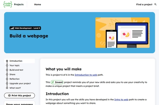
Years 9–10 Coding for web design 101
Read this longer-format article for examples of what authoring in the three layers does to change a user’s experience of a webpage.
Requires
- internet access
- computers, laptops or tablets
Suggested time
20 minutesEnables students to:
- understand the difference between the three layers
- understand how the three layers manifest in terms of a user’s web-browsing experience.

Years 9–10 HTML vs CSS vs JS
Explore this article to summarise the differences in form and function between the coding languages of the three layers.
Requires
- internet access
- computers, laptops or tablets
Suggested time
n/aEnables students to:
- remember the form and function of the coding languages that underlie the three layers.

Years 9–10 NotePad++
Use this small application as an improved version of Notepad to view and edit webpage files offline (Windows only).
Requires
- internet access
- Windows computers or laptops
- installation of NotePad++ (free application)
Suggested time
n/aEnables students to:
- open webpage files and display HTML and CSS in a neat and colour-labelled fashion (syntax highlighting)
- gain similar functionality for other code files.
Years 9–10 Visual Studio Code
Use this advanced application to view and edit webpage files offline on Windows or Mac.
Requires
- internet access
- computers or laptops
- installation of Visual Studio Code (free application)
Suggested time
n/aEnables students to:
- open webpage files and display HTML and CSS in a neat and colour-labelled fashion (syntax highlighting)
- use a complete programming IDE.
Resources to extend and integrate learning


Years 9–10 Evolution of web design 1990–2019
View this video to discover how webpages have changed over the past three decades and the developments in web technologies that enabled this.
Requires
- internet access
- computers, laptops or tablets
Suggested time
9 minutesEnables students to:
- know how webpage designs have evolved since the beginnings of the World Wide Web.
Years 9–10 What is three-tier architecture?
Read this article to explore a similar separation into three layers, in the field of software application design.
Requires
- internet access
- computers, laptops or tablets
Suggested time
10 minutesEnables students to:
- explore an analogous parallel for the three-layered structure of webpages in a different but related field.

Further reading and professional learning
-
Web design
Find out more -
Web Design Workbook
Find out more -
Coding for Designers Book – Chapter 2: Structure, Style & Behavior
Find out more

Years 9–10 Web design
Build websites and apps by learning HTML, CSS, and JavaScript. Projects for beginners and intermedaite learners.
Suggested time
1 hour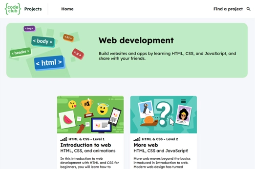
Years 9–10 Web Design Workbook
This resource from the Australian Maths Trust contains a succinct overview of HTML and CSS, useful cheat sheets for teachers and students, and a few activities.
Suggested time
30 minutes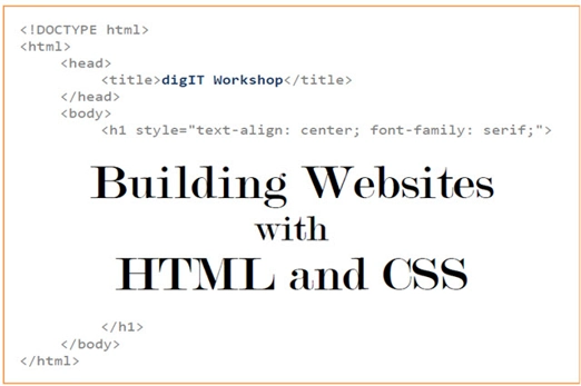
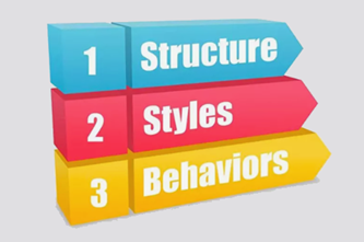
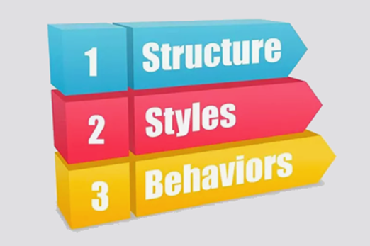
Years 9–10 Coding for Designers Book – Chapter 2: Structure, Style & Behavior
A short chapter from an online text that introduces and demystifies web coding to more traditionally trained designers. It explores the three layers of web design at some depth, from 2D and 3D perspectives.
Suggested time
30 minutes
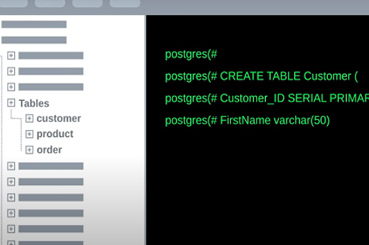
HTML and CSS
What is this about?
This topic takes a deeper dive into how the content and structure and presentation layers are achieved using hypertext markup language (HTML) and Cascading Style Sheets (CSS). Students are introduced to the markup languages of HTML and CSS, working with both to create simple webpages.
Content description
Represent documents online as content (text), structure (markup) and presentation (styling) and explain why such representations are important AC9TDI10K02
Design and prototype the user experience of a digital system AC9TDI10P07
This sequence enables students to:
- explain what HTML is, its basic components and syntax, and how it defines the content and structure layer of a webpage
- explain what CSS is, its basic components and syntax, and how it defines the presentation layer of a webpage
- apply HTML and CSS in tandem to create simple webpages.
Supplementary information
HTML and CSS are markup languages. They are neither general-purpose programming languages nor object-oriented programming languages.
Resources to include
Resources to introduce
-
Separation of Concerns
Find out more -
Introduction to HTML + Structure of an HTML Page
Find out more -
Introduction to CSS
Find out more -
Differences between HTML & CSS
Find out more

Years 9–10 Separation of Concerns
View this video to quickly understand how CSS can modulate HTML, using the analogy of a Word document.
Requires
- internet access
- computers, laptops or tablets
Suggested time
2 minutesEnables students to:
- understand how a change in presentation can efficiently effect multiple changes in the content and structure.
Years 9–10 Introduction to HTML + Structure of an HTML Page
View the first two videos of this playlist to introduce HTML tags and structure. Students can replicate the results using the CodeHS tool shown or another editing tool.
Requires
- internet access
- computers, laptops or tablets
- free CodeHS accounts for drag-and-drop blocks (optional)
Suggested time
15 minutesEnables students to:
- create a simple one-line webpage using a very basic HTML structure.
Years 9–10 Introduction to CSS
View this video to introduce a CSS rule and see how it can be used to modulate HTML. Students can replicate the results using the CodeHS tool shown or another editing tool.
Requires
- internet access
- computers, laptops or tablets
- free CodeHS accounts for drag-and-drop blocks (optional)
Suggested time
9 minutesEnables students to:
- modulate the presentation of an HTML tag in a simple one-line webpage using a very basic CSS rule.
Years 9–10 Differences between HTML & CSS
Use this infographic to remind students of the nature, uses and syntax structure of HTML and CSS.
Requires
- internet access
- computers or laptops
Suggested time
n/aEnables students to:
- remember and understand the differences between HTML and CSS.
Resources to develop and consolidate learning
-
Bird watch website 1.0
Find out more -
Introduction to HTML
Find out more -
CodePen
Find out more -
CodeHS IDE
Find out more -
HTML/CSS Starter
Find out more -
A matter of style
Find out more -
HTML & CSS courses and tutorial
Find out more


Years 9–10 Bird watch website 1.0
Build a website like the example provided viewed using trinket. Trinket is a free downlaodble app that lets you run and write code in any browser, on any device.
Suggested time
1 hour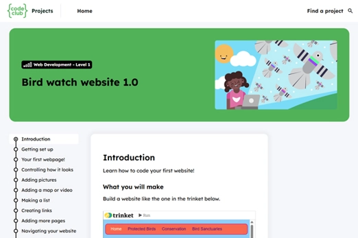
Years 9–10 Introduction to HTML
Use this to introduce markup and HTML and follow a step-by-step tutorial for structuring a body of plain text. The resource also mentions online HTML documentations.
Requires
- internet access
- computers or laptops
Suggested time
11 minutesEnables students to:
- understand what markup and HTML mean
- understand the basic structure of an HTML tag
- use basic HTML tags to structure a body of text.

Years 9–10 CodePen
A free online editor for practising developing webpages: write HTML, CSS and JavaScript and see the resulting webpage in real time.
Requires
- internet access
- device with internet access
Suggested time
n/aEnables students to:
- write and manipulate code in HTML or JavaScript (or both) and observe its representation as a webpage.

Years 9–10 CodeHS IDE
Use the block-view mode of this editor to use drag-and-drop blocks (similar to Scratch coding) rather than typing text.
Requires
- internet access
- computers or laptops
- free CodeHS accounts for drag-and-drop blocks (optional)
Suggested time
n/aEnables students to:
- author in HTML and see the resulting webpage.
Years 9–10 HTML/CSS Starter
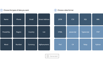
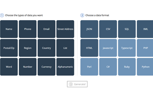
Work through this online self-paced course to attain beginner skills in using HTML tags and CSS rules to structure and stylise simple webpages.
Requires
- internet access
- computers or laptops
- free Grok Academy accounts
Suggested time
2 hoursEnables students to:
- write HTML tags with correct syntax to structure a webpage
- write CSS rules with correct syntax to stylise HTML elements in a webpage
- combine HTML and CSS to manipulate simple webpages to appear coherent, well laid out and aesthetically pleasing.

Years 9–10 A matter of style
Use this lesson to explore the benefits of using CSS to change presentation, while having students reflect on criteria for effective design.
Requires
- internet access
- computers or laptops
- if using Chrome browser: install Web Developer plugin (free)
Suggested time
1-2 hoursEnables students to:
- explore the versatility and importance of CSS
- evaluate and reflect on effective webpage designs achieved through CSS.

Years 9–10 HTML & CSS courses and tutorial
A selection of free HTML and CSS self-paced courses ranging from beginner to intermediate level. It is recommended starting with Learn HTML and Learn CSS.
Requires
- internet access
- computers or laptops
- free Codecademy accounts
Suggested time
10 hoursEnables students to:
- learn the basics of using HTML and CSS.
Resources to extend and integrate learning
-
HTML/CSS for Beginners 1 course
Find out more -
HTML/CSS for Beginners 2 course
Find out more -
HTML documentation
Find out more -
CSS documentation
Find out more -
The Evolution of HTML
Find out more -
A brief history of CSS
Find out more


Years 9–10 HTML/CSS for Beginners 1 course
Use this to continue building skills acquired in the HTML/CSS Starter course on Grok Academy.
Requires
- internet access
- computers or laptops
- free Grok Academy accounts
Suggested time
4 hoursEnables students to:
- learn more advanced usage of HTML and CSS.
Years 9–10 HTML/CSS for Beginners 2 course
Use this to continue building skills acquired in the HTML/CSS Starter and Beginners 1 modules on Grok Academy.
Requires
- internet access
- computers or laptops
- free Grok Academy accounts
Suggested time
3 hoursEnables students to:
- learn more advanced usage of HTML and CSS.
Years 9–10 HTML documentation
Access full online documentation referencing all of HTML.
Requires
- internet access
- computers, laptops or tablets
Suggested time
n/aEnables students to:
- access information on any aspect of the HTML language and its usage.

Years 9–10 CSS documentation
Access full online documentation referencing all of CSS.
Requires
- internet access
- computers, laptops or tablets
Suggested time
n/aEnables students to:
- access information on any aspect of the CSS language and its usage.
Years 9–10 The Evolution of HTML
Read this article for a history of the development of HTML over the decades.
Requires
- internet access
- computers, laptops or tablets
Suggested time
10 minutesEnables students to:
- learn about the beginnings of HTML and how it has evolved over many decades.

Years 9–10 A brief history of CSS
Read this article on the origins of CSS and how it came to dominate as the styling language of choice for web design.
Requires
- internet access
- computers, laptops or tablets
Suggested time
10 minutesEnables students to:
- learn about the beginnings of CSS and how it came to be the standard language for the presentation layer of webpages.

Further reading and professional learning
-
Why should educators use HTML as an introduction to coding?
Find out more -
Teaching web design with HTML and CSS
Find out more -
HTML Tutorial on w3schools
Find out more -
CSS Tutorial on w3schools
Find out more


Years 9–10 Why should educators use HTML as an introduction to coding?
A provocative article on the benefits of teaching HTML and CSS before general-purpose programming languages.
Suggested time
30 minutes
Years 9–10 Teaching web design with HTML and CSS
An article by a New Zealand teacher covering online self-guided courses, the ‘why’ and ‘how’ of HTML, and how to address specific concepts that students find more difficult.
Suggested time
30 minutes
Years 9–10 HTML Tutorial on w3schools
Use this free resource to quickly look up HTML concepts with straightforward examples.
Suggested time
30 minutes
Years 9–10 CSS Tutorial on w3schools
Use this free resource to quickly look up CSS concepts with straightforward examples.
Suggested time
30 minutes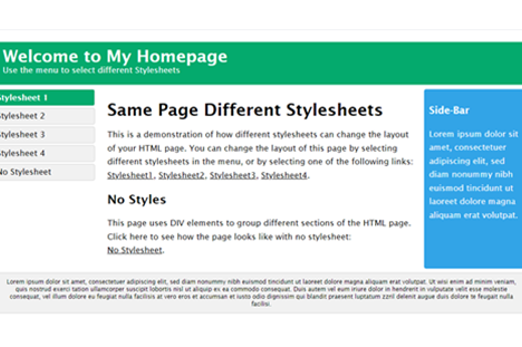
Designing a webpage for everyone
What is this about?
Students explore simple accessibility standards, tools and features in webpages, together capable of covering a large subset of people with accessibility needs.
Incorporating accessibility features into webpages is a shared responsibility and an expectation for web designers and developers, with benefits for everyone. A large number of circumstances may prevent a user from being able to properly access, operate and understand webpages. These include issues relating to hardware (for example, old legacy devices), software (for example, different browsers), networks (for example, limited internet bandwidth), individual disability or impairment (for example, hearing, vision or mobility) and environmental circumstances (for example, sunlight glare or being in a loud environment).
Content description
Represent documents online as content (text), structure (markup) and presentation (styling) and explain why such representations are important AC9TDI10K02
Design and prototype the user experience of a digital system AC9TDI10P07
Select and use emerging digital tools and advanced features to create and communicate interactive content for a diverse audience AC9TDI10P11
This sequence enables students to:
- understand the various factors that may negatively affect an internet user’s experience of a webpage
- appreciate the need for and benefits of providing equitable access to digital information for diverse audiences
- use their web design skills in ways that incorporate accessibility for a diverse audience of internet users.
Resources to include
Resources to introduce
-
Web Accessibility Perspectives
Find out more -
Do you REALLY need to care about web accessibility?
Find out more -
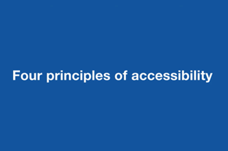
POUR: The 4 principles of accessibility
Find out more

Years 9–10 Web Accessibility Perspectives
View this video for 10 simple examples of web accessibility features that are essential for people with disability, and helpful for everyone. Use it to stimulate a discussion about the ethics involved in web accessibility.
Requires
- internet access
- computers, laptops or tablets
Suggested time
30 minutesEnables students to:
- discover a number of common simple web accessibility features
- explain why incorporating web accessibility features in webpages is important.

Years 9–10 Do you REALLY need to care about web accessibility?
View this video to dispel the myths of web accessibility being hard and being only for users with disability, with concrete examples of how it can be easily achieved in HTML or CSS.
Requires
- internet access
- computers, laptops or tablets
Suggested time
30 minutesEnables students to:
- appreciate that incorporating web accessibility is easy and benefits everyone
- learn some simple ways of achieving better accessibility on a webpage.
Years 9–10 POUR: The 4 principles of accessibility
Hear an accessibility expert break down the four accessibility principles of webpages and digital services. Discuss with students examples of when these are not followed.
Requires
- internet access
- computers, laptops or tablets
Suggested time
30 minutesEnables students to:
- understand the four principles of accessibility
- discuss why these four principles are important.
Resources to develop and consolidate learning
-
Bird watch website 2.0
Find out more -
Bird watch website 3.0
Find out more -
Tools for testing responsive design for websites
Find out more -
Alt text - why it’s important for accessibility and SEO
Find out more -
Contrast Checker
Find out more -
How to keyboard accessibility test
Find out more


Years 9–10 Bird watch website 2.0
Build upon your existing HTML/CSS skills to make a website and gain more control over how it looks. Apply this to the first website you built in Bird watch website 1.0.
Suggested time
1 hour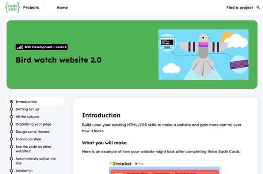
Years 9–10 Bird watch website 3.0
Build upon your existing HTML/CSS skills to make a website and gain more control over how it looks. These Sushi Cards will show you how to make your website look polished and professional using cool effects and layouts.
Suggested time
1 hour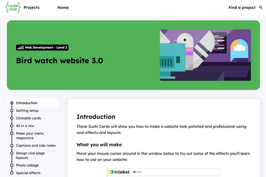
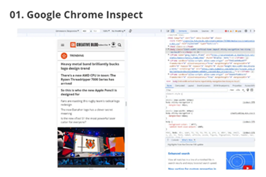
Years 9–10 Tools for testing responsive design for websites
Quickly test how different devices display a webpage. In Chrome or Edge, using mouse actions right-click on a website, choose Inspect, then find the Devices button to the left of the Elements tab.
Requires
- internet access
- computers or laptops
- Google Chrome or Edge (similar tools available in Safari and Firefox)
Suggested time
n/aEnables students to:
- view websites as they would be displayed on different devices’ screen sizes and resolutions.
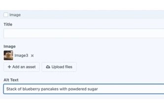
Years 9–10 Alt text - why it’s important for accessibility and SEO
Read this article to understand how alternative text is added, see examples of it done poorly and well, and appreciate its benefits.
Requires
- internet access
- computers, laptops or tablets
Suggested time
10 minutesEnables students to:
- understand the usage and benefits of the alternative text HTML tag.

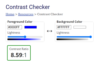
Years 9–10 Contrast Checker
Use this tool to help students understand what good colour contrast looks like.
Requires
- internet access
- computers or laptops
Suggested time
n/aEnables students to:
- select and view foreground-background colour pairs and have their contrast levels automatically evaluated.

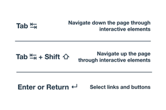
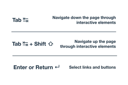
Years 9–10 How to keyboard accessibility test
View this video to explain how to check if a webpage is properly keyboard accessible. Students can try this on various websites.
Requires
- internet access
- computers or laptops
Suggested time
30 minutesEnables students to:
- understand the features that make a webpage properly keyboard accessible
- experiment with accessing webpages using a keyboard.
Resources to extend and integrate learning

Years 9–10 Web Content Accessibility Guidelines
Visit the official guidelines document for comprehensive web content accessibility published by the World Wide Web Consortium (W3C).
Requires
- internet access
- computers, laptops or tablets
Suggested time
n/aEnables students to:
- view the full guidelines for all possible accessibility features that are recommended for web content.

Further reading and professional learning

Years 9–10 Pairing screen reader with web browser
This short article lists which screen readers you might want to install to enable students to experience websites through them, depending on the browser(s) they are using.
Suggested time
30 minutes
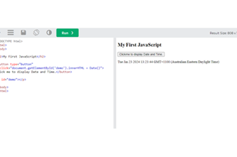
JavaScript in a webpage (optional)
What is this about?
Modern websites often incorporate elements that are interactive or responsive to user input, and interact with data sources. This functionality is achieved through the use of web programming languages – such as JavaScript – that allow for the implementation of algorithms, decisions, repetition, functions and data structures.
In this topic students explore how webpage elements (for example, images, text and links) become a graphical user interface for JavaScript, with this language adding ‘behaviour’ on top of the content, structure and presentation layers of webpages. JavaScript as a pure language is covered thoroughly in the Years 9-10 Programming unit.
Content description
Represent documents online as content (text), structure (markup) and presentation (styling) and explain why such representations are important AC9TDI10K02
Design algorithms involving logical operators and represent them as flowcharts and pseudocode AC9TDI10P05
Validate algorithms and programs by comparing their output against a range of test cases AC9TDI10P06
Design and prototype the user experience of a digital system AC9TDI10P07
Implement, modify and debug modular programs, applying selected algorithms and data structures, including in an object-oriented programming language AC9TDI10P09
This sequence enables students to:
- explain JavaScript's basic components and syntax and how it creates the behaviour layer of a webpage
- understand and apply some features of JavaScript to add interactivity and other behaviour elements to a webpage.
Supplementary information
This optional topic is not a full introduction to JavaScript, general-purpose programming or object-oriented programming. It does not cover the breadth of the skills and concepts available in the Years 9-10 Programming unit, which caters to Python and JavaScript.
Resources to include
Resources to introduce
-
What is JavaScript? What does it do, and what is it used for?
Find out more -
Keep Calm and Carry On Coding
Find out more
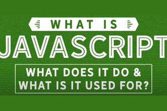
Years 9–10 What is JavaScript? What does it do, and what is it used for?
View this video to introduce JavaScript and give concrete examples of what it can do for webpages.
Requires
- internet access
- computers, laptops or tablets
Suggested time
30 minutesEnables students to:
- observe different ways that JavaScript adds behaviour and responsiveness to webpages.
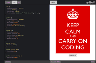
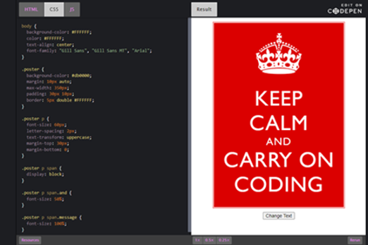
Years 9–10 Keep Calm and Carry On Coding
Use this lesson to examine and modify the HTML, CSS and JavaScript of a simple webpage.
Requires
- internet access
- computers or laptops
Suggested time
1 hourEnables students to:
- view the HTML, CSS and JavaScript for a simple webpage
- modify a webpage by altering its code.
Resources to develop and consolidate learning
-
Coding for GUIs course
Find out more -
Webpages with JavaScript
Find out more -
replit.com
Find out more


Years 9–10 Coding for GUIs course
Choose this lesson sequence to help students learn basic principles of graphical user interfaces while creating interactive webpages with HTML, CSS and JavaScript.
Requires
- internet access
- computers or laptops
Suggested time
10 hoursEnables students to:
- incorporate GUIs into programming focus on principles of user interface while using JavaScript code to make webpages interactive.

Years 9–10 Webpages with JavaScript
Choose this online course to work with HTML, CSS and JavaScript, providing students with interactive, self-marking coding exercises. The resource includes a teacher dashboard to monitor progress. * If students are new to HTML, this course should be preceded by HTML/CSS Starter.
Requires
- internet access
- computers, laptops or tablets
- free Grok Academy accounts
Suggested time
10 hours*Enables students to:
- learn JavaScript programming concepts in the context of webpages with HTML and CSS
- make interactive webpages using JavaScript and HTML
- build their own puzzle game.

Years 9–10 replit.com
Use this online environment to write and test HTML, CSS and JavaScript. Note: Selecting 'HTML, CSS, JS' starts a project with a webpage development experience.
Requires
- internet access
- computers or laptops
- free replit.com accounts (tied to individual email addresses)
Suggested time
n/aEnables students to:
- write and test JavaScript code in an online IDE (integrated development environment).

Resources to extend and integrate learning
-
Minecraft crafting table
Find out more -
Web development
Find out more -
JavaScript tutorial - What is AJAX?
Find out more
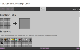

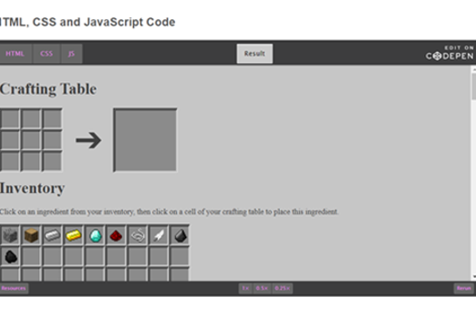
Years 9–10 Minecraft crafting table
Use this lesson to investigate the HTML, CSS and JavaScript code for a webpage, figure out how it works, then make modifications.
Requires
- internet access
- computers or laptops
Suggested time
1 hourEnables students to:
- view the HTML, CSS and JavaScript for a webpage and understand how it works
- modify a webpage by altering its code.
Years 9–10 Web development
Use this thorough online course to build skills for designing and maintaining webpages, including the use of JavaScript.
Requires
- internet access
- computers, laptops or tablets
- free CodeHS accounts
Suggested time
20 hoursEnables students to:
- complete projects on web development
- incorporate JavaScript into webpages.

Years 9–10 JavaScript tutorial - What is AJAX?
View this for a brief introduction to AJAX (Asynchronous JavaScript and XML) and how it enables some of the interactivity and responsiveness of Web 2.0 that we have become accustomed to.
Requires
- internet access
- computers, laptops or tablets
Suggested time
30 minutesEnables students to:
- describe AJAX and the type of functionality that it enables online.
Further reading and professional learning

Years 9–10 Learn JavaScript on w3schools
Use this free resource to quickly look up JavaScript concepts with straightforward examples.
Suggested time
30 minutes
Years 9–10 10 Reasons to learn JavaScript
This article covers the many uses and market dominance of JavaScript, explaining in particular the career and employability benefits of learning and mastering it.
Suggested time
30 minutes
Cybersecurity
Overview
This unit considers how and why data is kept secure on the internet. Students refresh and build on their understanding of network hardware and internet protocols. They examine the Australian Privacy Principles and their implications for individuals and organisations, providing a rationale to explore how cyberthreats can be investigated, modelled and mitigated. Students also learn and practise specific techniques for encrypting and compressing data, allowing it to be transmitted more securely and efficiently.
Achievement standards
By the end of Year 10 students explain how digital systems manage, control and secure access to data; and model cyber security threats and explore a vulnerability. Students apply privacy principles to manage digital footprints.
Australian Curriculum
Content descriptions
Digital systems AC9TDI10K01
Data representation AC9TDI10K03
Privacy and security AC9TDI10P13, AC9TDI10P14
Related content and General Capabilities
Digital Literacy: Managing and operating: Protect content, Select and operate tools
Critical and Creative Thinking: Generating, Analysing
This topic enables students to
- simulate networks and describe network protocols used to transmit and secure data on the internet
- reference and describe selected Australian Privacy Principles and their implications
- investigate and model cyberthreats and vulnerabilities that affect individuals and organisations
- practise simple data encryption algorithms
- describe and provide examples of data compression.
Supplementary information
The three sequences in this unit are designed to be covered in order.
Watch this video for a quick overview of the unit and how to use its resources with your students.
Assessment View assessment advice
Assessment
By the end of Year 10 students explain how digital systems manage, control and secure access to data; and model cyber security threats and explore a vulnerability. Students apply privacy principles to manage digital footprints.
Use this rubric to assess students’ knowledge and understanding of encryption and decryption, particularly through public and private-key cryptography, and the role they play in cybersecurity safeguarding sensitive information, ensuring secure communication, and protecting against unauthorized access or data breaches.
| Encryption and decryption | with guidance can describe encryption | describes the purpose of encryption | describes one method of encryption and explains the particular need(s) met by the encryption method | suggests shortcomings of an encryption method |
| Public and private-key cryptography | with guidance can describe public and private-key cryptography | describes a situation in which public/private-key encryption is used | describes the function of a public and a private key | demonstrates an appreciation of the needs met by public/private-key encryption and demonstrates the detailed operation of public/private-key encryption |
Unit sequence
This topic offers 3 sequential units
Unit 1
Keeping data moving
Students explore how devices are addressed across the internet and describe protocols used to ensure data integrity across a network.Unit 2
Keeping data secure – why and how
Students explore common vulnerabilities affecting software and digital systems, and describe common ways of mitigating cyberthreats.Unit 3
Encrypting and compressing data
Students explore encryption algorithms that have been used to protect data. They investigate encryption techniques used to protect data on the internet, such as public key cryptography and hashing. They explore how data such as images, audio and video are compressed to make streaming media possible.Keeping data moving
What is this about?
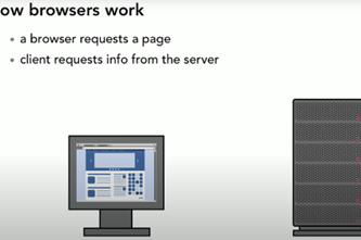
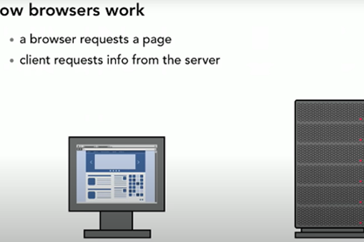
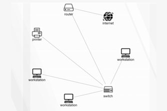
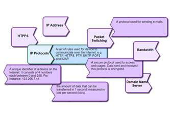
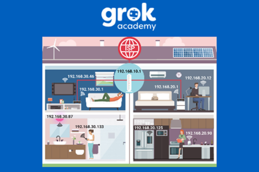
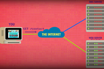
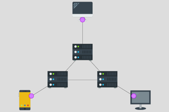
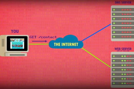
Internet hardware and software use various protocols and systems to ensure data is correctly delivered from one device to another across local networks and across the world. Students can explore the TCP/IP protocol, domain name system (DNS) and domain tables, and simulate networks to investigate how devices like routers direct packets of data to other devices.
Content description
Investigate how hardware and software manage, control and secure access to data in networked digital systems AC9TDI10K01
This sequence enables students to:
- explore how devices are addressed across the internet
- describe protocols used to ensure data integrity across a network (accurate transmission from one device to another)
- simulate networks.
Resources to include
Resources to introduce


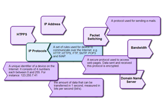
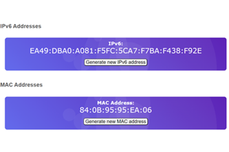
Years 9–10 The internet: IP addresses and DNS
View this video to introduce how addresses are assigned to devices so that data can be sent across the internet.
Requires
- internet access
- computers, laptops or tablets to view the video
Suggested time
10 minutesEnables students to:
- gain an understanding of IP addresses and the internet protocol
- define domain name system (DNS).

Years 9–10 Working together
Use this lesson to explore network concepts through role-play and vocabulary definitions, starting with a computer's own CPU processes.
Requires
- printed script and worksheets (documents provided)
Suggested time
2 hoursEnables students to:
- develop understandings of the role of hardware and software in managing, controlling and securing the movement of and access to data in networked digital systems.

Resources to develop and consolidate learning
-
The internet: packets, routing and reliability
Find out more -
Networking – Cyber security
Find out more -
The internet course unit
Find out more -
Filius
Find out more -
Network design tool
Find out more -
LAN Party
Find out more -
Computer Networks Concepts
Find out more


Years 9–10 The internet: packets, routing and reliability
View this video to continue the introduction of internet technology concepts.
Requires
- internet access
- computers, laptops or tablets to view the video
Suggested time
10 minutesEnables students to:
- describe how the internet protocol and associated protocols emphasise reliability of data transfer.

Years 9–10 Networking – Cyber security
Choose this online course to explore IP addresses, routing, DNS and some security concepts with hands-on exercises and challenges.
Requires
- internet access
- computers or laptops
- class set of micro:bits (optional)
- free Grok Academy accounts
Suggested time
6 hoursEnables students to:
- discover IP addresses, routers and DNS
- use a micro:bit or micro:bit simulator in an interactive, self-marking coding environment.

Years 9–10 The internet course unit
Choose this lesson series to introduce key concepts about the internet while using a network simulation tool.
Requires
- internet access
- computers, laptops or tablets
- free code.org accounts
Suggested time
6 hoursEnables students to:
- explore network addresses and their purpose
- explore routers and their use in directing network traffic
- collaboratively simulate network hardware, traffic and protocols.

Years 9–10 Filius
Use this sophisticated offline application to simulate networks. Instructional videos and other resources are also available.
Requires
- Windows or Linux computers or laptops
- installation of Filius (free application)
Suggested time
30 minutesEnables students to:
- simulate networks
- practise using IP addresses, subnet masks and other networking concepts.

Years 9–10 Network design tool
Use this student-friendly tool to design a network diagram.
Requires
- internet access
- computers, laptops or tablets
Suggested time
1 hourEnables students to:
- identify network components
- construct a network diagram.

Years 9–10 LAN Party
Use this unplugged lesson to explore and practise using IP addresses, and learn about the concept of subnet masks.
Requires
- printed lesson with worksheets (documents provided)
Suggested time
1 hourEnables students to:
- explore how subnet masks make it possible to keep IP addresses unique within an individual network.
Years 9–10 Computer Networks Concepts
Use this interactive to connect definitions related to the internet and network protocols.
Requires
- internet access
- computers, laptops or tablets
Suggested time
15 minutesEnables students to:
- test their knowledge of network and internet terminology.
Resources to extend and integrate learning

Years 9–10 The Internet
View this video for a more technical introduction to the internet protocol, DNS, TCP/IP and UDP.
Requires
- internet access
- computers, laptops or tablets to view the video
Suggested time
15 minutesEnables students to:
- gain a condensed overview of significant foundational concepts related to the internet.

Years 9–10 Networking basics
Use this professional (free) online course from networking giant Cisco to cover networking concepts in detail.
Requires
- internet access
- computers, laptops or tablets
- free Cisco Networking Academy accounts
Suggested time
20 hoursEnables students to:
- work through and assess a broad range of networking concepts in a professional-oriented course.

Further reading and professional learning
-
IP addresses, MAC addresses and URLs
Find out more -
TCP/IP stack: Network layers and protocols
Find out more -
How computer networks work
Find out more

Years 9–10 IP addresses, MAC addresses and URLs
This article introduces the addresses used to identify devices on networks.
Suggested time
30 minutes
Years 9–10 TCP/IP stack: Network layers and protocols
This article introduces a four-layer model for understanding how data is addressed, routed and finally transmitted through the internet.
Suggested time
30 minutes
Years 9–10 How computer networks work
This article gives an accessible introduction to a number of network theory concepts.
Suggested time
30 minutes
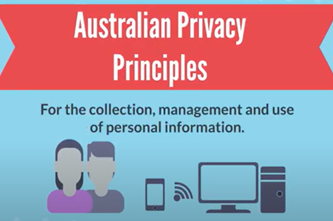
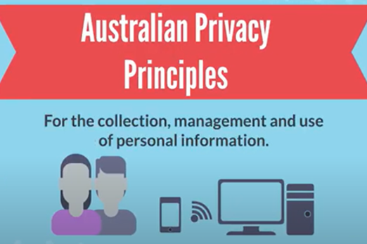
Keeping data secure – why and how
What is this about?
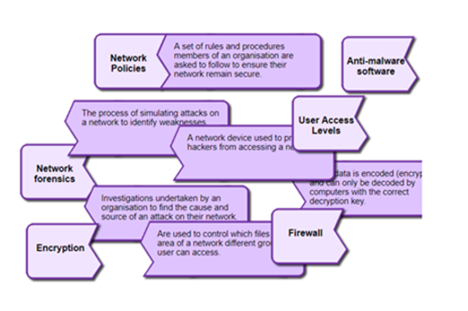
The Australian Privacy Principles govern the way organisations can keep and use individuals' data, among other things. This means organisations of various scales are obliged to address potential and real cyberthreats. Students investigate the 13 principles, then explore how cybersecurity professionals model and mitigate cyberthreats.
Content description
Investigate how hardware and software manage, control and secure access to data in networked digital systems AC9TDI10K01
Develop cyber security threat models, and explore a software, user or software supply chain vulnerability AC9TDI10P13
Apply the Australian Privacy Principles to critique and manage the digital footprint that existing systems and student solutions collect AC9TDI10P14
This sequence enables students to:
- reference and describe the 13 Australian Privacy Principles, and some of their important applications
- describe common vulnerabilities affecting software and digital systems more generally
- explore how cyberthreats are investigated and modelled
- describe common ways of mitigating cyberthreats, such as access control.
Resources to include
Resources to introduce
-
Australian Privacy Principles quick reference
Find out more -
Australian Privacy Principles
Find out more

Years 9–10 Australian Privacy Principles quick reference
Refer to this Australian Government document to view a summary of the 13 Australian Privacy Principles.
Requires
- internet access
- computers, laptops or tablets
Suggested time
15 minutesEnables students to:
- describe the basics of the Australian Privacy Principles.

Years 9–10 Australian Privacy Principles
View this video for a concise outline of the 13 Australian Privacy Principles. View with the official quick reference.
Requires
- internet access
- computers or laptops to view video
Suggested time
15 minutesEnables students to:
- gain a brief, clear overview of what the 13 Australian Privacy Principles are designed to do.
Resources to develop and consolidate learning
-
Cybersecurity
Find out more -
Digital Forensics
Find out more -
Modelling Cyber Threats
Find out more -
Cybersecurity and Global Impacts course unit
Find out more -
Network Security Terminology
Find out more -
CS4G Network Simulator
Find out more


Years 9–10 Cybersecurity
View this video for a condensed introduction to common cyberthreats and mitigations. Continue with the Hackers and cyber attacks video.
Requires
- internet access
- computers or laptops to view video
Suggested time
13 minutesEnables students to:
- learn about software and network vulnerabilities that leave systems open to attacks, such as brute force attacks and malware
- discover types of cyberthreats such as social engineering, buffer overflow and code injection.
Years 9–10 Digital Forensics
Use this online course to learn and practise techniques for investigating and solving a data breach, using a virtual machine.
Requires
- internet access
- computers or laptops
- free Grok Academy accounts
Suggested time
3 hoursEnables students to:
- learn and practise skills used in investigating data breaches
- see the Australian Privacy Principles in context
- work with a virtual machine.

Years 9–10 Modelling Cyber Threats
Discover how cyber security professionals use modelling tools to identify system threats and understand the risks they pose. Learn from experts as they take you through the goals of cyber security, and the numerous threats posed by attackers and hackers.
Requires
- internet access
- computers or laptops
- free Grok Academy accounts
Suggested time
3 hoursEnables students to:
- explore how organisations prepare themselves to deal with cyberthreats
- learn about the CIA model for understanding and mitigating cyberthreats.
Years 9–10 Cybersecurity and Global Impacts course unit
Choose this lesson series to introduce key concepts about data privacy cyberthreats.
Requires
- internet access
- computers, laptops or tablets
- free code.org accounts
Suggested time
9 hoursEnables students to:
- consider organisational policies for data security (not Australia specific)
- discover common security risks and their mitigations.

Years 9–10 Network Security Terminology
Use this interactive to connect definitions related to network security and cyberthreats.
Requires
- internet access
- computers or laptops
Suggested time
15 minutesEnables students to:
- test their knowledge of terminology related to network security and cyberthreats.
Years 9–10 CS4G Network Simulator
Use this online platform to simulate different cyber attacks on a network.
Requires
- internet access
- computers or laptops
Suggested time
15 minutesEnables students to:
- test their knowledge of terminology related to network security and cyberthreats.

Resources to extend and integrate learning
-
MI6: Mission Alpha
Find out more -
Web security
Find out more -
Cyber Hunt
Find out more -
REDSPICE
Find out more -
ASD CyberEXP
Find out more
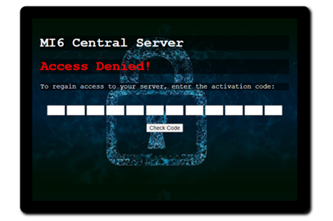


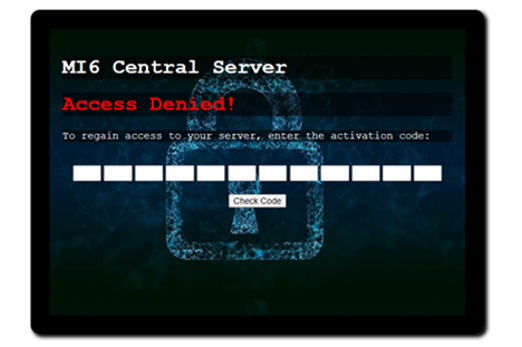
Years 9–10 MI6: Mission Alpha
Use this short lesson series to combine knowledge of algorithms with cybersecurity concepts such as authentication and threat mitigation.
Requires
- internet access
- computers or laptops
Suggested time
2 hoursEnables students to:
- apply algorithm knowledge to crack phone authentication systems
- explore cyberthreat modelling while creating a network forensics report
- recommend mitigations for cyberthreats.
Years 9–10 Web security
Use this online course to focus on the ways websites are protected from cyberthreats.
Requires
- internet access
- computers or laptops
- free Grok Academy accounts
Suggested time
6 hoursEnables students to:
- identify and mitigate threats to websites and services, using a simulated web browser environment.

Years 9–10 Cyber Hunt
Select short, standalone activities recommended for years 9–10.
Requires
- internet access
- computers, laptops or tablets
Suggested time
5–15 minutes each activityEnables students to:
- warm up at the start of lessons
- explore vulnerabilities that relate to privacy and cybersecurity.
Years 9–10 REDSPICE
Read about the Australian Government's large-scale initiative to boost national cybersecurity, announced in 2022.
Requires
- internet access
- computers or laptops to view article
Suggested time
15 minutesEnables students to:
- describe the initiative to boost national cybersecurity.

Years 9–10 ASD CyberEXP
Use this course to focus on careers in cybersecurity.
Requires
- internet access
- computers, laptops or tablets
- free LifeJourney accounts
Suggested time
2 hoursEnables students to:
- learn about cybersecurity careers and skills.

Further reading and professional learning
-
Network security
Find out more -
Keeping data secure on a network
Find out more -
Privacy and security infographic (F-10)
Find out more
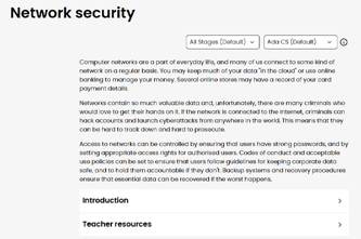

Years 9–10 Network security
This comprehensive online guide, provides a background to network security. This topic has information on encryption and authentication.
Suggested time
30 minutes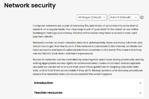
Years 9–10 Keeping data secure on a network
This series of pages from BBC Bitesize cover relevant cybersecurity topics.
Suggested time
30 minutes
Years 9–10 Privacy and security infographic (F-10)
Explore privacy and security for your Year band.
Suggested time
30 mins
Encrypting and compressing data
What is this about?
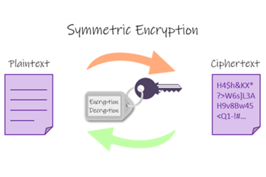
Encryption techniques make data less readable – and thus less accessible – so that it can be transmitted more securely across a network and decrypted at its destination. Compression techniques exploit patterns in data so that it can be reduced in size for more efficient transmission, such as for streaming video with a lower bitrate. Students explore and try out different encryption and compression methods.
Content description
Investigate how hardware and software manage, control and secure access to data in networked digital systems AC9TDI10K01
Investigate simple data compression techniques AC9TDI10K03
This sequence enables students to:
- explore and practise encryption algorithms that have been used to protect data
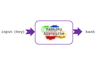
- describe encryption techniques used to protect data on the internet, such as public key cryptography and hashing
- describe how data such as images, sounds and video are compressed to make streaming media possible.
Resources to include
Resources to introduce


Years 9–10 Cryptography
View this video for a condensed introduction to contemporary encryption techniques, including the Advanced Encryption Standard (AES), symmetric and asymmetric encryption, and public key encryption.
Requires
- internet access
- computers or laptops to view video
Suggested time
15 minutesEnables students to:
- learn about a modern binary encryption method (AES)
- describe general approaches to encryption such as one-way functions and public key encryption.
Years 9–10 Guess the sentence
While applicable to younger year levels, use this unplugged activity to introduce the concept of compression of data.
Requires
- at least three pieces of paper per student, and pens
Suggested time
30 minutesEnables students to:
- explore the concept of information as applied to text
- discuss how text (and images, sound and video) might be compressed.

Years 9–10 Compression
View this video for an overview of the theory behind compression techniques for images and audio.
Requires
- internet access
- computers or laptops to view video
Suggested time
15 minutesEnables students to:
- compare lossy and lossless compression
- gain and introduction to run-length encoding
- observe how image compression works
- hear an explanation of audio and video compression.

Resources to develop and consolidate learning
-
Keeping secrets
Find out more -
Kid Krypto
Find out more -
Cryptography
Find out more -
Symmetric vs asymmetric encryption
Find out more -
Text compression widget
Find out more -
Data compression
Find out more -
Compression
Find out more -
Audacity
Find out more


Years 9–10 Keeping secrets
In this lesson sequence students examine cryptography and modern encryption methods for transmitting digital data securely. Encryption of data is a means of protecting data, one example being the use of secret and public keys.
Requires
- internet access
- computers or laptops
- spreadsheet software (for example, Microsoft Excel, Google Sheets)
- printed worksheets (included)
Suggested time
2 hoursEnables students to:
- use spreadsheet functions to encrypt and decrypt text with well-known ciphers.

Years 9–10 Kid Krypto
Use this unplugged activity to explore how public key encryption (where both communicators do not need to share a private key) works.
Requires
- slides or handouts (included)
Suggested time
1 hourEnables students to:
- discover what makes public key encryption possible.

Years 9–10 Cryptography
Use this online course to explore classic cryptographic ciphers and how to break them.
Requires
- internet access
- computers, laptops or tablets
- free Grok Academy accounts
Suggested time
6 hoursEnables students to:
- explore and practise encryption and decryption
- learn about cybersecurity careers.
Years 9–10 Symmetric vs asymmetric encryption
Read this article to learn about symmetric and asymmetric encryption, and how they combine for SSL handshakes. Includes interactive tools.
Requires
- internet access
- computers, laptops or tablets
Suggested time
45 minutesEnables students to:
- explain common encryption techniques and practices.
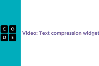
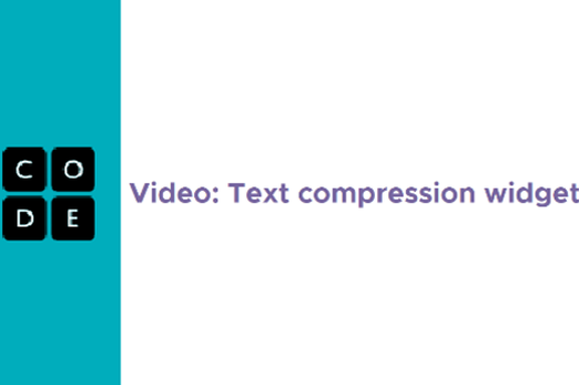
Years 9–10 Text compression widget
Try this text compression widget to apply the concept of identifying patterns of repeated information.
Requires
- internet access
- computers, laptops or tablets
Suggested time
20 minutesEnables students to:
- practise compressing text by identifying repeated information.
Years 9–10 Data compression
Use this lesson to practise working with RGB pixels, leading to a discussion of image compression.
Requires
- internet access
- computers, laptops or tablets
Suggested time
90 minutesEnables students to:
- work with RGB values and bitmasks
- discuss how images might be compressed.

Years 9–10 Compression
Use this free online textbook chapter to delve into compression theory and techniques.
Requires
- internet access
- computers, laptops or tablets
Suggested time
90 minutesEnables students to:
- investigate different compression techniques and applications.
Years 9–10 Audacity
Use this popular sound editing tool to demonstrate the effect of different compression rates on audio quality.
Requires
- computers or laptops
- installation of Audacity (free application)
Suggested time
1 hourEnables students to:
- use software to record audio and visualise its digital samples
- export audio into files with different compression levels to listen to the effect on the sound.

Resources to extend and integrate learning
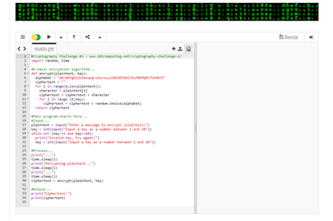
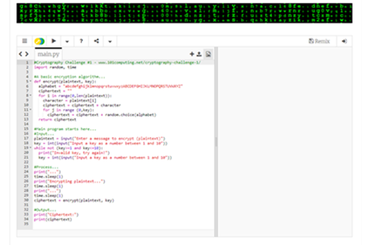
Years 9–10 Cryptography challenge
Try this challenge to write a decryption algorithm in Python, based on the given encryption algorithm.
Requires
- internet access
- computers, laptops or tablets
Suggested time
2 hoursEnables students to:
- apply their general-purpose programming skills to a cryptography context.
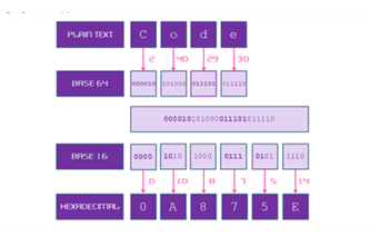
Years 9–10 Cryptographic Challenge: Base64 to Hex
Try this challenge to practise the Base64 encoding in a programming language.
Requires
- internet access
- computers, laptops or tablets
- a programming environment (for example, for Python or JavaScript)
Suggested time
2 hoursEnables students to:
- apply their general-purpose programming skills to a cryptography context
- try designing and implementing code to perform Base64 encoding.

Further reading and professional learning

Years 9–10 Encryption
Read this online textbook chapter for key, student-appropriate information on encryption. The resource includes some interactives.
Suggested time
30 minutes
Years 9–10 Hashing algorithms for storing sensitive data
This article gives a clear explanation of hashing algorithms, a technique for one-way encryption.
Suggested time
30 minutes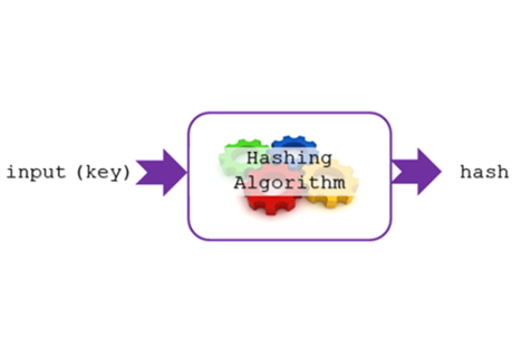
Data science skills
Overview
This unit introduces data science as a process, focusing on specific skills used in data science. These include the acquisition of data from surveys, sensors or online repositories; storage and analysis of that data; and its visualisation, including with interactivity. When acquiring and analysing data, students can apply the Australian Privacy Principles formally introduced in the years 9–10 Cybersecurity unit. They can also build on the database and spreadsheet skills introduced in the years 7–8 Working with data unit, now querying relational databases and using more advanced spreadsheet formulas and functions.
Achievement standards
By the end of Year 10 students acquire, interpret and model complex data with databases and represent documents as content, structure and presentation. They use advanced features of digital tools to create interactive content, and to plan, collaborate on, and manage agile projects. Students apply privacy principles to manage digital footprints.
Australian Curriculum
Content descriptions
Acquiring, managing and analysing data AC9TDI10P01, AC9TDI10P02, AC9TDI10P03
Generating and designing AC9TDI10P07
Privacy and security AC9TDI10P14
Related content and General Capabilities
Mathematics: Statistics AC9M9ST02, AC9M9ST04, AC9M8ST05
Digital Literacy: Practising digital safety and wellbeing, Investigating, Managing and operating
Critical and Creative Thinking
This topic enables students to
- explore the structure of simple relational databases and use Structured Query Language (SQL) to query them
- apply spreadsheet formulas, functions and techniques to clean and analyse data
- create interactive visualisations of data
- explore the process of data science
- acquire data from surveys, electronic sensors and online repositories
- apply the Australian Privacy Principles to consider digital footprints and the protection of personal data.
Supplementary information
This unit focuses on building specific skills rather than providing the opportunity for a purposeful design project. Students may choose to undertake their own data investigation in the unit Student-driven project.
It is possible to use programming languages, such as Python, to perform data analysis. Some resources in this unit may reference techniques and tools; however, they do not constitute an introduction to general-purpose programming. See the Years 9-10 Programming unit.
While Microsoft Excel is the most often mentioned spreadsheet tool in this unit, other popular software such as Google Sheets and Apple Numbers perform many of the same functions, such as formulas and charts. Consider which software suites your school makes available to students.
Watch this video for a quick overview of the unit and how to use its resources with your students.
Assessment View assessment advice
Assessment
By the end of Year 10 students acquire, interpret and model complex data with databases and represent documents as content, structure and presentation. They use advanced features of digital tools to create interactive content, and to plan, collaborate on, and manage agile projects. Students apply privacy principles to manage digital footprints.
Use this rubric to assess students’ knowledge and understanding of:
- use of relational databases to organise and structure data and perform data retrieval
- use of spreadsheets and data visualisation.
| Relational databases to organise and structure data and perform data retrieval | with guidance, can create a basic database structure and with support uses a relevant query to retrieve data | design and implement a basic database structure and perform simple queries to retrieve data | creates and manages a well-structured database and efficiently retrieves data using relevant queries | creates and manages a sophisticated database and efficiently retrieves data using complex queries |
| Spreadsheet and data visualisation | with guidance can perform basic data tasks in spreadsheet software and with support creates basic visualisations of data | performs basic data tasks using spreadsheet software and basic visualisations of data | applies advanced functions and pivot tables independently in spreadsheet software for effective data analysis. Creates interactive visualisations with features such as buttons and dropdowns for data selection | completes complex data tasks with precision using advanced functions and pivot tables. Creates sophisticated interactive visualisations, incorporating dynamic features for data selection |
| Data science life-cycle: defining objectives, collecting and cleaning data, performing analysis, and deriving insights | with guidance, applies elements of the data science life-cycle | applies aspects of the data science life-cycle. Uses basic data acquisition techniques and employs basic data cleaning methods. Uses analytical tools for simple insights | applies the data science life-cycle process effectively in real-world scenarios. Demonstrates proficiency in data acquisition techniques, employs thorough data cleaning methods, and uses analytical tools to derive meaningful insights | applies the data science life-cycle process to complex real-world scenarios. Uses advanced data acquisition techniques, thorough data cleaning methods, and utilises sophisticated analytical tools for in-depth insights |
Unit sequence
This topic offers 3 sequential units
Unit 1
Accessing data in relational databases
Students explore relational databases to organise and structure data to retrieve only the data that is relevant to their needs.Unit 2
Analysing and visualising data with spreadsheets
Students use spreadsheet software for data tasks, applying advanced functions and pivot tables. They create interactive visualisations with features such as buttons and dropdowns for data selection.Unit 3
The process of data science
Students apply the data science life-cycle process to real-world scenarios, practising data acquisition techniques, employing data cleaning methods, and using analytical tools to derive insights.Accessing data in relational databases
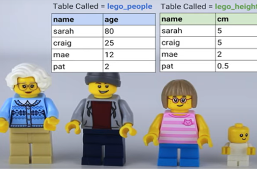
What is this about?
Relational databases allow data to be structured in more complex and organised ways than are possible in a standard spreadsheet. By understanding the relationships between tables within a database, students can create queries (including with SQL) to retrieve only the data that is relevant to their needs. This output can be exported to a spreadsheet for further analysis.
Content description
Develop techniques to acquire, store and validate data from a range of sources using software, including spreadsheets and databases AC9TDI10P01
Analyse and visualise data interactively using a range of software, including spreadsheets and databases, to draw conclusions and make predictions by identifying trends and outliers AC9TDI10P02
Model and query entities and their relationships using structured data AC9TDI10P03
This sequence enables students to:
- review the record structure for data
- explore how databases organise data via simple relationships between tables
- visualise the relationships using entity relationship diagrams
- make queries on single-table and multi-table databases to select data that meets particular criteria.
Resources to include
Resources to introduce
-
Database tutorial for beginners
Find out more -
What is SQL?
Find out more -
Database uses
Find out more


Years 9–10 Database tutorial for beginners
View this video to review why a database is often used instead of a spreadsheet, and to introduce entity relationship diagrams, which visualise the relationships between tables in a database.
Requires
- internet access
- computers, laptops or tablets
Suggested time
10 minutesEnables students to:
- review how and why a database is structured differently from a spreadsheet
- explore entity relationship diagrams and relationships between tables in a database.
Years 9–10 What is SQL?
View this short video to review the basics of SQL, the standard language for interacting with relational databases.
Requires
- internet access
- computers, laptops or tablets
Suggested time
5 minutesEnables students to:
- describe the functions of SQL and how it allows data to be requested from a database (as well as added, removed or updated).
Years 9–10 Database uses
Use this short revision module with test to review the basic terms and concepts for databases.
Requires
- internet access
- computers, laptops or tablets
Suggested time
30 minutesEnables students to:
- understand terms such as ‘record’, ‘field’, ‘query’, ‘form’ and ‘report’
- understand basic database concepts.
Resources to develop and consolidate learning
-
Intro to SQL
Find out more -
SQL Murder Mystery
Find out more -
How to use Microsoft Access
Find out more -
OpenOffice Base
Find out more -
Everything you always wanted to know
Find out more -
generatedata.com
Find out more


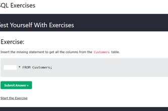
Years 9–10 Intro to SQL
Use this online course to learn and practise SQL in an auto-marked environment.
Requires
- internet access
- computers or laptops
- free Grok Academy accounts
Suggested time
3 hoursEnables students to:
- learn SQL with an existing online database
- practise SQL queries in an auto-marked environment.
Years 9–10 SQL Murder Mystery
Use this fun investigation challenge to learn and apply SQL in a fully self-contained online environment.
Requires
- internet access
- computers, laptops or tablets
Suggested time
2 hoursEnables students to:
- learn SQL with an existing online database
- undertake an immersive investigation challenge.

Years 9–10 How to use Microsoft Access
Follow this short but comprehensive video to create a simple database in Microsoft Access.
Requires
- computers or laptops (no remote or local server needed)
- installation of Microsoft Access (part of Microsoft Office suites)
Suggested time
1 hourEnables students to:
- create a database as a single file
- practise queries, forms and reports.
Years 9–10 OpenOffice Base
Use this free alternative to Microsoft Access for creating simple databases offline, without setting up servers. OpenOffice Base contains much of the same functionality as Microsoft Access, allowing students to create and manage a database as a single file on their computer or laptop.
Requires
- computers or laptops (no remote or local server needed)
- installation of OpenOffice (free alternative to Microsoft Office)
Suggested time
30 minutesEnables students to:
- create and manage a database as a single file.

Years 9–10 Everything you always wanted to know
Use this lesson to focus on database design and evaluation of impact, while applying existing database skills.
Requires
- computers or laptops
- prior familiarity with creating a database
- a tool for creating databases, such as Microsoft Access, OpenOffice Base or a web-based solution
Suggested time
2 hoursEnables students to:
- discuss database design
- design a database for purpose
- create a database
- evaluate the impact of the database.

Years 9–10 generatedata.com
Use websites like this to generate test data for use in spreadsheets and databases when real-world data is not available.
Requires
- internet access
- computers, laptops or tablets
Suggested time
30 minutesEnables students to:
- generate random test data
- export this data into spreadsheet or other forms.
Resources to extend and integrate learning
Years 9–10 Computer Science Principles Data unit
Use this unit to work with database data using the AppLab environment, combining programming with data analysis.
Requires
- internet access
- computers, laptops or tablets
- free code.org accounts
Suggested time
9 hoursEnables students to:
- learn data science principles alongside programming skills.
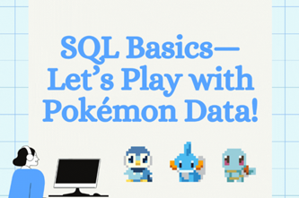
Years 9–10 Let's play with Pokémon data
Consider the idea in this article as a student-friendly data set for working in databases and SQL.
Requires
- computers or laptops
- prior familiarity with creating a database
- a tool for creating databases, such as Microsoft Access, OpenOffice Base or a web-based solution
Suggested time
15 minutesEnables students to:
- create or query a database.

Further reading and professional learning

Years 9–10 SQL
This comprehensive online guide, provides a background to databases in particular SQL. SQL is short for Structured Query Language; it's a language that is used for constructing statements called queries to perform operations on the data within a database.
Suggested time
30 minutes
Years 9–10 Learn SQL on w3schools
Use this free resource to quickly look up SQL concepts with straightforward examples.
Suggested time
30 minutes
Analysing and visualising data with spreadsheets
What is this about?
While specialised tools exist for cleaning, analysing and visualising data, spreadsheet software remains ubiquitous due to its flexibility and accessible features. Students build on skills developed in previous years to apply more advanced functions and powerful functions like pivot tables. They explore how charts and other visualisations can be made interactive, such as by allowing buttons and dropdowns to select a different series of data.
Content description
Develop techniques to acquire, store and validate data from a range of sources using software, including spreadsheets and databases AC9TDI10P01
Analyse and visualise data interactively using a range of software, including spreadsheets and databases, to draw conclusions and make predictions by identifying trends and outliers AC9TDI10P02
Design and prototype the user experience of a digital system AC9TDI10P07
Apply the Australian Privacy Principles to critique and manage the digital footprint that existing systems and student solutions collect AC9TDI10P14
This sequence enables students to:
- clean a spreadsheet by filtering data that is unnecessary for purpose
- depersonalise a spreadsheet by removing data that unnecessarily contributes to a digital footprint
- apply spreadsheet formulas and tools such as pivot tables to analyse data
- create interactive charts to visualise data.
Resources to include
Resources to introduce
-
Information is beautiful
Find out more -
Google Public Data
Find out more -
Data analytics course
Find out more -
Choose your own statistics
Find out more -
How does income relate to life expectancy?
Find out more


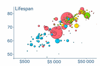
Years 9–10 Information is beautiful
Explore a collection of interesting and engaging data visualisations.
Requires
- internet access
- computers, laptops or tablets
Suggested time
30 minutesEnables students to:
- be inspired by unique and interesting data visualisations.

Years 9–10 Google Public Data
Engage with dynamic data visualisations that display many layers of information.
Requires
- internet access
- computers, laptops or tablets
Suggested time
30 minutesEnables students to:
- describe ways data visualisations can dynamically layer information.

Years 9–10 Data analytics course
Use this online course to review principles of working with data.
Requires
- internet access
- computers, laptops or tablets
- free Grok Academy accounts
Suggested time
2 hoursEnables students to:
- review the use of spreadsheets in the context of solving problems
- understand foundational principles of data analysis.
Years 9–10 Choose your own statistics
This interactive resource helps students find out more about important issues by exploring different statistics about Australian society. Students can download data sets.
Requires
- internet access
- computers, laptops or tablets
Suggested time
2 hoursEnables students to:
- describe ways data visualisations can dynamically layer information.

Years 9–10 How does income relate to life expectancy?
This video gives information about factors that affect life expectancy between countries. The webpage includes downloadable data sets and supporting resources.
Requires
- internet access
- computers, laptops or tablets
Suggested time
30 minutesEnables students to:
- describe ways data visualisations can dynamically layer information.

Resources to develop and consolidate learning
-
Microsoft Excel activities
Find out more -
A spreadsheet's secret weapon
Find out more -
How to create interactive charts in Excel
Find out more -
Sleep survey
Find out more -
Trees and satellites
Find out more -
Data Science STEM resources
Find out more -
Australian Privacy Principles quick reference
Find out more


Years 9–10 Microsoft Excel activities
Use this series of activities and worksheets to review spreadsheet skills.
Requires
- internet access
- computers or laptops
- spreadsheet software (for example, Microsoft Excel, Google Sheets, Apple Numbers)
Suggested time
5 hoursEnables students to:
- learn core spreadsheet skills through activities and worksheets.

Years 9–10 A spreadsheet's secret weapon
Use this lesson to introduce pivot tables, a powerful tool for interactively organising and visualising data in a spreadsheet.
Requires
- internet access
- computers or laptops
- Microsoft Excel (pivot tables are also possible in Google Sheets)
Suggested time
2 hoursEnables students to:
- use hands-on activities to learn how effective pivot tables can be
- practise with data sets.

Years 9–10 How to create interactive charts in Excel
Follow this article for a guide to giving visualisations interactivity without pivot tables, in Microsoft Excel.
Requires
- internet access
- computers or laptops
- Microsoft Excel (pivot tables are also possible in Google Sheets)
Suggested time
1 hourEnables students to:
- add user interface elements to a spreadsheet to make a chart interactive.

Years 9–10 Sleep survey
Use this survey, data set and accompanying activities to acquire real data and analyse it with spreadsheets.
Requires
- internet access
- computers or laptops
- spreadsheet software (Microsoft Excel, Google Sheets, Apple Numbers)
Suggested time
4 hoursEnables students to:
- participate in the full process of data acquisition and analysis
- use a pre-prepared online survey system to acquire data
- obtain a real data set and use spreadsheets to analyse it.

Years 9–10 Trees and satellites
Use this survey, data set and accompanying activities to acquire real data and analyse it with spreadsheets.
Requires
- internet access
- computers or laptops
- spreadsheet software (Microsoft Excel, Google Sheets, Apple Numbers)
Suggested time
4 hoursEnables students to:
- participate in the full process of data acquisition and analysis
- use a pre-prepared online survey system to acquire data
- obtain a real data set and use spreadsheets to analyse it.
Years 9–10 Data Science STEM resources
Choose from these six lessons in which students work with real data sets about marine and coastal populations of animals. Note: These lessons are not recommended for introducing spreadsheet skills for the first time.
Requires
- computers. laptops or tablets
- spreadsheet software (Microsoft Excel, Google Sheets, Apple Numbers)
Suggested time
3 hoursEnables students to:
- perform investigations on real scientific data sets
- apply spreadsheet skills to analyse data and create visualisations.

Years 9–10 Australian Privacy Principles quick reference
Quickly look up any of the 13 Australian Privacy Principles or download the poster.
Requires
- internet access
- computers, laptops or tablets
Suggested time
30 minutesEnables students to:
- look up the principles that outline the responsibilities of organisations in Australia when it comes to acquiring, using and keeping data.
Resources to extend and integrate learning


Years 9–10 CSIRO educational datasets
Choose from these six lessons to work with real data sets using spreadsheets or with programming. Note: These lessons do not provide an introduction to spreadsheet skills or programming skills.
Requires
- computers. laptops or tablets
- spreadsheet software (Microsoft Excel, Google Sheets, Apple Numbers)
- a programming environment (optional)
Suggested time
3 hoursEnables students to:
- perform investigations on a diverse range of real data sets
- apply spreadsheet or programming skills to analyse data and create visualisations.

Years 9–10 generatedata.com
Use websites like this to generate test data for use in spreadsheets and databases when real-world data is not available.
Requires
- internet access
- computers, laptops or tablets
Suggested time
30 minutesEnables students to:
- generate random test data
- export this data into spreadsheet or other forms.
Years 9–10 CORGIS
Use this site to download data sets in forms that can be readily worked with in Python and other general-purpose programming languages.
Requires
- internet access
- computers, laptops or tablets
Suggested time
30 minutesEnables students to:
- download data sets in the form of Python modules for smart use in Python programming projects
- download data sets in JSON format for use in Python or JavaScript
- download data sets in CSV format for use in spreadsheet software.

Further reading and professional learning
-
Microsoft Excel
Find out more -
Data knowledge and skills: structuring data in a spreadsheet
Find out more -
Data knowledge and skills: analysing and visualising data
Find out more -
Microsoft Excel Tutorial for Beginners
Find out more -
Guide to data analytics and the Australian Privacy Principles
Find out more


Years 9–10 Microsoft Excel
Use the built-in tutorials in Excel (available at the top of the Home screen when you first launch) to learn important skills; for example, Formula tutorial, PivotTable tutorial.
Suggested time
30 minutes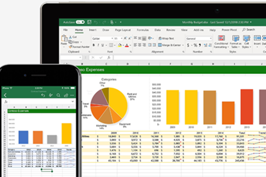
Years 9–10 Data knowledge and skills: structuring data in a spreadsheet
Part 3 of a video series designed to enhance your understanding of data and its simple manipulation in spreadsheets. This is demonstrated step by step and in the context of comparing the price of a Big Mac around the world.
Suggested time
30 minutes
Years 9–10 Data knowledge and skills: analysing and visualising data
Part 4 of a video series designed to enhance your understanding of data and its simple manipulation in spreadsheets using the context of comparing the price of a Big Mac around the world.
Suggested time
30 minutes
Years 9–10 Microsoft Excel Tutorial for Beginners
Use this extensive tutorial video (2.5 hr) with six real-world projects to learn foundational spreadsheet skills.
Suggested time
30 minutes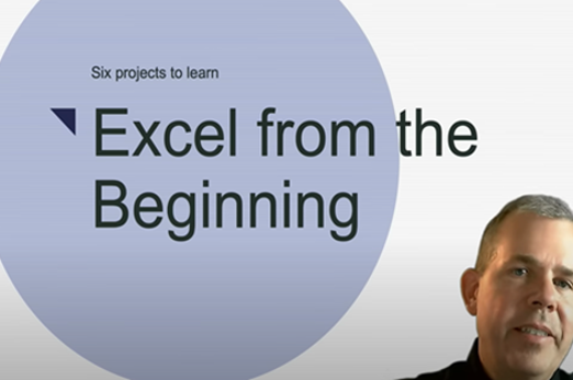
Years 9–10 Guide to data analytics and the Australian Privacy Principles
Refer to official advice given to organisations by the Office of the Australian Information Commissioner.
Suggested time
30 minutes
The process of data science
What is this about?
The data science process – sometimes called the data science life cycle – captures the stages of data acquisition, cleaning and analysis with a purpose in mind. It provides a structured framework for data scientists to follow, ensuring a purpose-driven approach to extracting meaningful insights from raw data. Students can apply this framework to real-world scenarios, practising data acquisition techniques, employing data cleaning methods, and using analytical tools to derive insights. By working on hands-on projects or exercises, students can enhance their skills in systematically approaching and solving problems within the context of the data science life cycle.
Content description
Develop techniques to acquire, store and validate data from a range of sources using software, including spreadsheets and databases AC9TDI10P01
Analyse and visualise data interactively using a range of software, including spreadsheets and databases, to draw conclusions and make predictions by identifying trends and outliers AC9TDI10P02
This sequence enables students to:
- gain an overview of the data science life cycle and what data scientists do
- practise applying principles and stages of data science that incorporate hands-on skills with spreadsheets.
Resources to include
Resources to introduce
-
Intro to data science
Find out more -
The data science process: a visual guide
Find out more -
Different data science roles explained
Find out more

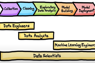
Years 9–10 Intro to data science
View the first 10 minutes of this video for a concise, high-level overview of what data scientists do.
Requires
- internet access
- computers, laptops or tablets
Suggested time
10 minutesEnables students to:
- gain an overview of what data scientists do.

Years 9–10 The data science process: a visual guide
View this video for an introduction to modern representations of the data science life cycle.
Requires
- internet access
- computers, laptops or tablets
Suggested time
10 minutesEnables students to:
- see the data science life cycle as broken down into two models.

Years 9–10 Different data science roles explained
View or display this infographic for a quick reference of the data science life cycle and the roles of various data professionals.
Requires
- internet access
- computers, laptops or tablets
Suggested time
30 minutesEnables students to:
- view the data science life cycle
- compare the roles of data scientists, data engineers and data analysts.
Resources to develop and consolidate learning
-
Top ten ways to clean your data
Find out more -
Data science
Find out more -
Explorations in data science course
Find out more -
Big data
Find out more -
Kaggle
Find out more -
Aboriginal and Torres Strait Islander connections
Find out more

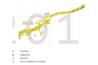


Years 9–10 Top ten ways to clean your data
Use these steps to clean data sets.
Requires
- internet access
- computers, laptops or tablets
Suggested time
30 minutesEnables students to:
- describe and use ways to clean a data set.
Years 9–10 Data science
Use these lessons to introduce students to data science concepts that empower them to use data to investigate problems and make changes to the world around them.
Requires
- internet access
- computers, laptops or tablets
- teacher registration to access free downloadable teaching resources from teachcomputing.org
Suggested time
30 minutesEnables students to:
- explain how visualising data can help identify patterns and trends to help us gain insights
- use an appropriate software tool to visualise data sets and look for patterns or trends.

Years 9–10 Explorations in data science course
Select units and sections from this curriculum (US based) to introduce principles and skills for data science.
Requires
- internet access
- computers, laptops or tablets
- spreadsheet software (for example, Microsoft Excel, Google Sheets)
Suggested time
12 hoursEnables students to:
- explore a range of data science principles and skills, including data acquisition, analysis, presentation and impact.

Years 9–10 Big data
Use this teaching module developed for Western Australian schools to introduce and apply data science skills, including spreadsheets. Note: This is a considerably long, US-based sequence of learning intended for high school. Teachers may wish to carefully select relevant units and sections for Australian students at years 9–10.
Requires
- internet access
- computers, laptops or tablets
- spreadsheet software (for example, Microsoft Excel, Google Sheets)
- printed worksheets (linked in document)
Suggested time
6 hoursEnables students to:
- explore data science in the form of a design process
- work with data using spreadsheets
- use their data analysis to inform an innovation.

Years 9–10 Kaggle
Use this website to find data sets for many different topics.
Requires
- internet access
- computers, laptops or tablets
Suggested time
30 minutesEnables students to:
- find and download data sets.

Years 9–10 Aboriginal and Torres Strait Islander connections
Use these ideas to consider the ways of data acquisition used by Aboriginal and Torres Strait Islander peoples.
Requires
- internet access
- computers, laptops or tablets
Suggested time
1 hourEnables students to:
- practise obtaining data from an online data repository
- perform basic cleaning on the data.

Resources to extend and integrate learning
Years 9–10 Data and medicine
View this video for an exploration of how computer science and medicine combine in the area of DNA sequencing.
Requires
- internet access
- computers, laptops or tablets
Suggested time
10 minutesEnables students to:
- be inspired by the application of computer science in the field of medicine.
Further reading and professional learning
-
Big Data
Find out more -
Data knowledge and skills: gathering data
Find out more -
Data knowledge and skills: authenticating data
Find out more -
Australian Data Science Education Institute
Find out more


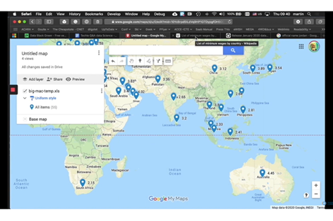

Years 9–10 Big Data
This comprehensive online guide, provides a background on big data. This topic has information on data mining and predictive analytics.
Suggested time
30 minutes
Years 9–10 Data knowledge and skills: gathering data
Part 1 of a video series designed to enhance your understanding of data and its simple manipulation in spreadsheets. This is demonstrated step by step and in the context of comparing the price of a Big Mac around the world.
Suggested time
13 minutes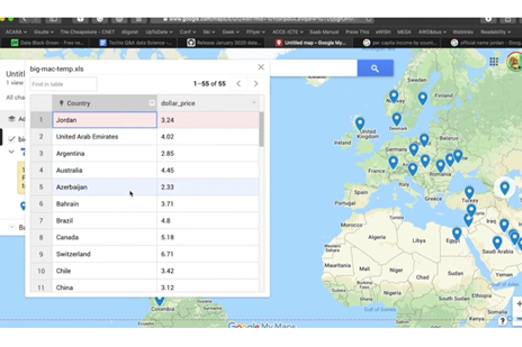
Years 9–10 Data knowledge and skills: authenticating data
Part 2 of a video series designed to enhance your understanding of data and its simple manipulation in spreadsheets using the context of comparing the price of a Big Mac around the world.
Suggested time
9 minutes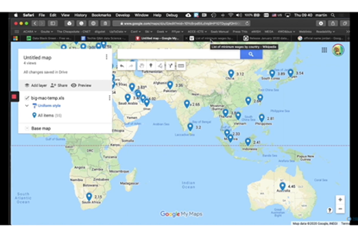
Years 9–10 Australian Data Science Education Institute
Visit and subscribe to this website for resources and workshops on teaching data science.
Suggested time
30 minutes
Programming
Overview
This unit builds on the algorithm design and general-purpose programming skills developed in years 7–8, continuing in the use of Python or JavaScript.
Students practise using logical operators such as OR, NOT and AND in their algorithms. They employ formal validation in their code and use test cases for testing it. They are introduced to data structures like lists in their code implementation, and practise using debugging tools to step through and analyse their code.
Finally, they explore the object-oriented paradigm for organising code.
Achievement standards
By the end of Year 10 students design and validate algorithms and implement them, including in an object-oriented programming language.
Australian Curriculum
Content descriptions
Generating and designing AC9TDI10P05, AC9TDI10P06
Producing and implementing AC9TDI10P09
Related content and General Capabilities
Mathematics: Space AC9M9SP03, AC9M10SP03
Digital Literacy: Creating and exchanging, Managing and operating
Critical and Creative Thinking
This topic enables students to
- use flowcharts and pseudocode to follow and design algorithms
- code and test programs in a general-purpose programming language capable of object-oriented programming (OOP), such as Python or JavaScript
- utilise data structures such as lists
- understand the purpose and foundational concepts of OOP.
Supplementary information
This unit focuses on building specific skills through concept exploration and exercises in pure code implementation without the use of robots or electronics (though these can also be valid contexts for developing these skills).
The final topic Object-oriented programming provides a limited number of resources for exploring the object-oriented paradigm with students of both Python and JavaScript.
Watch this video for a quick overview of the unit and how to use its resources with your students.
Assessment View assessment advice
Assessment
Use this work sample WS01 - Digital project: Python game development as a guide for how you can assess student’s understanding, skills and process related to programming.
Use this rubric as a starting point for assessment of object-oriented programming (OOP).
| Knowledge of OOP principles | with guidance can identify basic elements of OOP | describes the basic concepts of OOP, including the purpose of classes and objects | describes the concept of OOP, including the purpose of classes and objects providing relevant examples | describes the concept of OOP in detail, including the purpose of classes and objects providing relevant examples and explains the benefits |
| Programming a digital solution using OOP principles | with guidance is able to build some classes for the design | builds correct classes for the design | builds relevant classes for the design, organising code effectively, and integrating classes into a single correct working program | creates a well-structured program that integrates classes including at least one correctly working feature to their program |
Unit sequence
This topic offers 3 pathways
Core Unit
Designing algorithms
Students build and consolidate their knowledge and skills in the design of algorithms represented as flowcharts and as pseudocode.Programming in Python
Using Python, students implement algorithms as programs organised with functions. They incorporate a range of data structures.Programming in JavaScript
Using JavaScript, students can implement algorithms as programs organised with functions, and can use data structures such as arrays (also called lists).Object-oriented programming
Students use the object-oriented paradigm as a way of organising code that is often considered more natural and effective than simply using isolated functions. Students can use Python, JavaScript or another suitable language.Designing algorithms
What is this about?
Students build and consolidate their knowledge and skills in the design of algorithms represented as flowcharts and as pseudocode. They practise using logical operators such as OR, NOT and AND. They employ formal validation such as existence, range and type checks, and use test cases to systematically test their algorithms against design criteria.
As a specific area of algorithm design, students compare sorting algorithms; that is, different procedures for working through an unsorted set of values to arrive at a sorted set.
Content description
Design algorithms involving logical operators and represent them as flowcharts and pseudocode AC9TDI10P05
Validate algorithms and programs by comparing their output against a range of test cases AC9TDI10P06
This sequence enables students to:
- design algorithms as flowcharts and pseudocode
- understand and use logical operators such as OR, NOT and AND
- understand and use formal validation such as existence, range and type checks
- write and apply test cases.
Supplementary information
While this topic appears before the implementation topics in this unit, students in years 9 and 10 may benefit from performing algorithm design and testing in tandem with code implementation, rather than as a completely separate activity.
Resources to include
Resources to introduce
-
Programming basics
Find out more -
Flowchart recipes sample
Find out more -
Successful pseudocoding
Find out more -
Trace tables
Find out more


Years 9–10 Programming basics
View this video for a fast recap of algorithm fundamentals.
Requires
- internet access
- computers or laptops to view the video
Suggested time
30 minutesEnables students to:
- revise the concept of algorithms
- review control structures for interaction (looping) and branching (conditionals)
- review the purpose of functions.

Years 9–10 Flowchart recipes sample
View this free spread from the book Flowchart Recipes: An Engineer's Cookbook (Sami Matilainen) and discuss how the same flowchart shapes are used in code algorithms.
Requires
- internet access
- computers or laptops to view the flowchart
Suggested time
30 minutesEnables students to:
- observe a flowchart in an unusual context
- connect the basic flowchart symbols (for example, box, parallelogram, diamond) with their use in code algorithms.
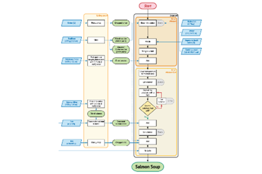
Years 9–10 Successful pseudocoding
Select from this lesson sequence to review pseudocode conventions and code tracing.
Requires
- printed text (document provided)
- internet access
- computers or laptops to view the resource
Suggested time
2 hoursEnables students to:
- review writing pseudocode with exercises
- review tracing algorithms with exercises.

Years 9–10 Trace tables
View this video to revise tracing an algorithm.
Requires
- internet access
- computers or laptops to view the video
Suggested time
6 minutesEnables students to:
- observe a worked example of using a trace table to test a pseudocode algorithm.
Resources to develop and consolidate learning
-
What's the fastest way to alphabetize your bookshelf?
Find out more -
Algorithms part 1: the essentials
Find out more -
Searching and sorting
Find out more -
Code breaking using Trace Tables
Find out more -
Design your own logic gates circuits
Find out more -
Boolean game
Find out more -
How to write a test case
Find out more -
Entry fees calculator using a flowchart
Find out more -
Average night's sleep survey
Find out more


Years 9–10 What's the fastest way to alphabetize your bookshelf?
View this video to introduce sorting algorithms in a clear, simple way.
Requires
- internet access
- computers, laptops or tablets to view video
Suggested time
30 minutesEnables students to:
- observe three different sorting algorithms without exploring their flowcharts or pseudocode.
Years 9–10 Algorithms part 1: the essentials
Use this lesson to learn about the fundamentals of algorithms.
Requires
- internet access
- computers, laptops or tablets
- register for free account to download lessons
Suggested time
2-3 hoursEnables students to:
- analyse and create flow charts using the flow chart symbols
- use a trace table to walk through code that contains a while loop, a for loop, and a list of items
- use a trace table to detect and correct errors in a program.
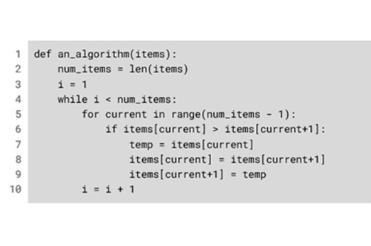
Years 9–10 Searching and sorting
This lesson includes activities on searching and sorting algorithms.
Requires
- internet access
- computers, laptops or tablets
- register for free account to download lessons
Suggested time
2-3 hoursEnables students to:
- compare the features of linear and binary search and decide which is most suitable in a given context
- interpret the code for linear search and binary search
- trace code for both searching algorithms with input data.
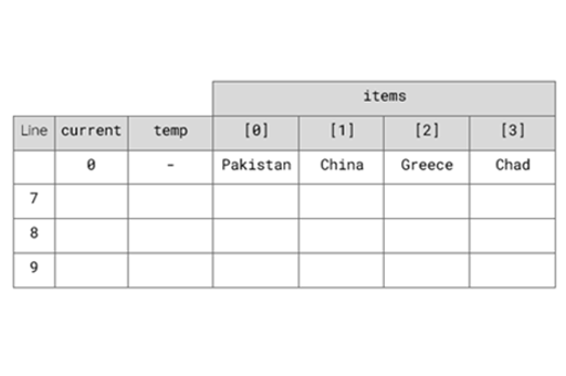
Years 9–10 Code breaking using Trace Tables
Practise using trace tables with this online activity.
Requires
- internet access
- computers, laptops or tablets
Suggested time
1 hourEnables students to:
- practise tracing pseudocode with trace tables.

Years 9–10 Design your own logic gates circuits
Use this interactive to introduce binary logic such as AND and OR by means of common electronic symbols. We also recommend Logic Gates Circuits in Cars for a more applied continuation of this skill.
Requires
- internet access
- computers or laptops
Suggested time
30 minutesEnables students to:
- visualise the logic of AND, OR and NOT using logic gates.
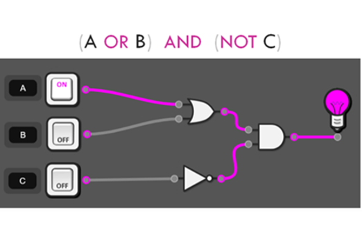
Years 9–10 Boolean game
Use this game to practise Boolean operations AND, OR and NOT.
Requires
- internet access
- computers, laptops or tablets
Suggested time
15 minutesEnables students to:
- practise the logic of AND, OR and NOT in a simple selection game.
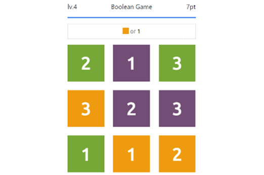
Years 9–10 How to write a test case
View this video for a simple introduction to test cases as used in industry.
Requires
- internet access
- computers, laptops or tablets to view video
Suggested time
30 minutesEnables students to:
- observe an example of a test case being written.

Years 9–10 Entry fees calculator using a flowchart
With a simple algorithm, practise a whole process from algorithm design to test cases. (Note: Implementation need not be done in Python.)
Requires
- internet access
- computers, laptops or tablets
Suggested time
1 hourEnables students to:
- design the flowchart for your algorithm
- use a test case to trace and fix errors in the algorithm.
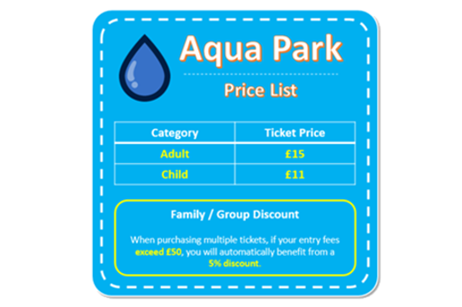
Years 9–10 Average night's sleep survey
Practise the algorithmic process from algorithm design to test cases.
Requires
- internet access
- computers, laptops or tablets
Suggested time
1 hourEnables students to:
- design the flowchart for your algorithm
- use a test case to trace and fix errors in the algorithm.

Resources to extend and integrate learning
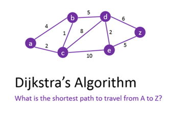


Years 9–10 Djikstra's shortest path algorithm
Use this interactive to introduce a popular algorithm for finding a shortest path. As a more complex alternative, try the interactive on the A star Algorithm.
Requires
- internet access
- computers or laptops
Suggested time
1 hourEnables students to:
- apply steps from an algorithm to find the shortest path between two nodes in a network.
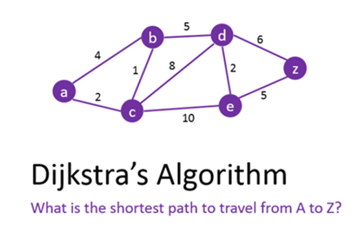
Years 9–10 AlgoRhythmics
View sorting algorithms performed as traditional dances. (We recommend Bubble Sort and Quick Sort).
Requires
- internet access
- computers, laptops or tablets to view video
Suggested time
30 minutesEnables students to:
- observe sorting algorithms performed as traditional European dances.

Years 9–10 Bebras
Challenge students with algorithmic thinking tasks designed for years 9–10.
Requires
- internet access
- computers, laptops or tablets
Suggested time
2 hoursEnables students to:
- complete online or unplugged tasks that require algorithmic thinking
- (optionally) register and compete in a biannual competition.
Further reading and professional learning
-
Computational thinking
Find out more -
Program design
Find out more -
Encryption
Find out more -
Testing
Find out more -
Boolean Algebra Tutorial
Find out more -
Pedagogy 2-pagers and podcasts
Find out more
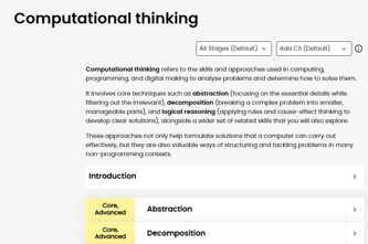
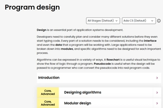
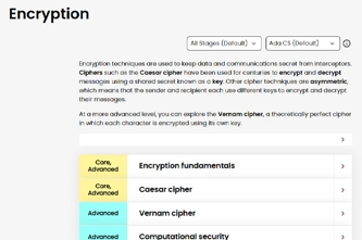
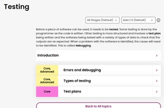


Years 9–10 Computational thinking
This comprehensive online guide, provides a background to computational thinking which refers to the skills and approaches used in computing, programming, and digital solutions to analyse problems and determine how to solve them.
Suggested time
30 minutes
Years 9–10 Program design
This comprehensive online guide, explores ways specific algorithms are designed for large applications, considering data and user interface. Learn how algorithms can be expressed as a flowchart and pseudocode, and validated and verified.
Suggested time
30 minutes
Years 9–10 Encryption
This comprehensive online guide, provides a background to encryption.
Suggested time
30 minutes
Years 9–10 Testing
This comprehensive online guide, provides a background to testing code. This topic has information on debugging and writing a test plan.
Suggested time
30 minutes
Years 9–10 Boolean Algebra Tutorial
Read this short tutorial to learn the basics of AND, OR and NOT logic.
Suggested time
30 minutes
Years 9–10 Pedagogy 2-pagers and podcasts
Read useful 2-page articles on coding pedagogy, including Code tracing and PRIMM. Podcasts also available.
Suggested time
30 minutes
Programming in Python
What is this about?
Students continue to build their skills in Python, a popular general-purpose programming language for secondary years that emphasises readability of code. Using Python, students can implement algorithms as programs organised with functions. Python also gives the programmer a range of data structures to use, from the basic list to tuples and dictionaries.
Most development environments for Python provide debugging tools, allowing students to step through their programs line by line as they run, and query the values of variables.
Content description
Design algorithms involving logical operators and represent them as flowcharts and pseudocode AC9TDI10P05
Validate algorithms and programs by comparing their output against a range of test cases AC9TDI10P06
Implement, modify and debug modular programs, applying selected algorithms and data structures, including in an object-oriented programming language AC9TDI10P09
This sequence enables students to:
- write and test code in Python, organising their code with functions
- understand and use data structures such as lists and dictionaries
- use debugging tools in their Python development environment
- optionally, explore how to create a graphical user interface (GUI) for their Python applications.
Resources to include
Resources to introduce
-
Introduction to Programming (Python)
Find out more -
Shakespearean Insult Generator
Find out more -
What's your superhero name?
Find out more


Years 9–10 Introduction to Programming (Python)
Use this online course to refresh or introduce Python fundamentals to students, with interactive, self-marking coding exercises.
Requires
- internet access
- computers or laptops
- free Grok Academy accounts
Suggested time
10 hoursEnables students to:
- learn Python programming concepts at their own pace, with a teacher dashboard to monitor progress
- complete exercises in an interactive, self-marking coding environment.

Years 9–10 Shakespearean Insult Generator
Use this pair of lessons to introduce lists – Python's basic data structure for storing multiple values.
Requires
- internet access
- computers or laptops
Suggested time
2 hoursEnables students to:
- explore the use of lists in a specific task
- practise Python code implementation.

Years 9–10 What's your superhero name?
Use this lesson to introduce dictionaries – a common data structure in Python.
Requires
- internet access
- computers or laptops
Suggested time
1 hourEnables students to:
- explore the use of dictionaries in a specific task
- practise Python code implementation.
Resources to develop and consolidate learning
-
Intro to computer science in Python
Find out more -
Introduction to Programming 2 (Python)
Find out more -
Is my credit card valid?
Find out more -
Sorting algorithms
Find out more -
replit.com
Find out more -
Python Tutor
Find out more -
Thonny
Find out more


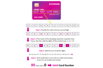
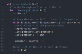

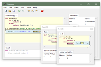
Years 9–10 Intro to computer science in Python
Choose this online platform to be able to customise a sequence of modules for your class, including data structure skills.
Requires
- internet access
- computers, laptops or tablets
- free CodeHS accounts
Suggested time
20 hoursEnables students to:
- learn Python programming concepts at their own pace, with a teacher dashboard to monitor progress.

Years 9–10 Introduction to Programming 2 (Python)
Choose this online course to continue from Introduction to Programming, including data structures and files.
Requires
- internet access
- computers or laptops
- free Grok Academy accounts
Suggested time
10 hoursEnables students to:
- learn intermediate Python programming skills such as lists, dictionaries and reading and writing files
- practise at their own pace, with a teacher dashboard to monitor progress
- complete exercises in an interactive, self-marking coding environment.

Years 9–10 Is my credit card valid?
Practise Python coding by implementing the validation algorithm used to check credit card numbers.
Requires
- internet access
- computers or laptops
Suggested time
1 hourEnables students to:
- implement a given algorithm in Python
- practise Python code implementation.

Years 9–10 Sorting algorithms
Examine pseudocode and test Python code for common sorting algorithms introduced in the Designing algorithms topic.
Requires
- internet access
- computers or laptops
Suggested time
1 hourEnables students to:
- view and discuss pseudocode for four common sorting algorithms
- view and test Python code for these algorithms.
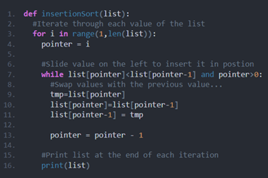
Years 9–10 replit.com
Use this online environment to write and test Python programs.
Requires
- internet access
- computers or laptops
- free replit.com accounts (tied to individual email addresses)
Suggested time
n/aEnables students to:
- write and test Python code in an online integrated development environment (IDE).
Years 9–10 Python Tutor
Use this online tool to visualise Python code as you run it.
Requires
- internet access
- computers or laptops
Suggested time
n/aEnables students to:
- write Python code then step through line by line
- show visualisations of the variables in their code.
Years 9–10 Thonny
Use this tool for a very basic offline environment to code in Python.
Requires
- computers or laptops
- Thonny (must be installed on Windows, Mac or Linux)
Suggested time
n/aEnables students to:
- write and test Python code in a simple integrated development environment (IDE) without relying on online environments.
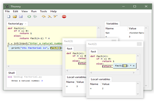
Resources to extend and integrate learning
-
PySimpleGUI: Design patterns
Find out more -
Book analysis with AI techniques
Find out more -
Cloud Computing
Find out more -
NCSS Challenge Python
Find out more -
Visual Studio Code
Find out more


Years 9–10 PySimpleGUI: Design patterns
Use this library to develop a graphical user interface (GUI) in Python. The design patterns provide starting points for coding a GUI.
Requires
- computers or laptops
- an online Python environment (for example, this replit.com template), or offline Python environment (for example, Thonny)
Suggested time
n/aEnables students to:
- use extra functions and variables to create a GUI in Python
- avoid some of the more complex base code needed for GUI engines like tkinter.
Years 9–10 Book analysis with AI techniques
Apply Python coding that uses natural language processing to discover the heroes and villains in books.
Requires
- internet access
- computers, laptops or tablets
Suggested time
8 hoursEnables students to:
- practise Python coding with the help of demonstration videos
- develop a program that performs sentiment analysis to analyse whole texts.

Years 9–10 Cloud Computing
Use this course to apply Python code to the use of APIs through the JSON format. This allows student programs to access data from remote sites, such as for weather or satellite locations.
Requires
- internet access
- computers or laptops
- free Grok Academy accounts
Suggested time
6 hoursEnables students to:
- explore what APIs are
- learn to access data from APIs through the JSON format, with Python code
- practise at their own pace, with a teacher dashboard to monitor progress
- complete exercises in an interactive, self-marking coding environment.

Years 9–10 NCSS Challenge Python
Provide online coding challenges for students during February and July (beginners and intermediate streams).
Requires
- internet access
- computers, laptops or tablets
- free Grok Academy accounts
Suggested time
5 weeksEnables students to:
- participate in a national coding challenge
- receive online support from human volunteers while coding.

Years 9–10 Visual Studio Code
Use this software for a full-featured offline environment to code in Python.
Requires
- computers or laptops
- Visual Studio Code (must be installed on Windows, Mac or Linux)
Suggested time
n/aEnables students to:
- write and test Python code in a full-featured integrated development environment (IDE) without relying on online environments.
Further reading and professional learning
-
Python courses on Codecademy
Find out more -
Learn Python on w3schools
Find out more -
PySimpleGUI: the simple way to create a GUI with Python
Find out more -
Pedagogy 2-pagers and podcasts
Find out more -
Programming infographic: years 9–10
Find out more

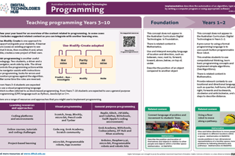
Years 9–10 Python courses on Codecademy
Choose one of the free courses if you prefer a separate, non-school-tailored environment to skill yourself up in Python programming.
Suggested time
30 minutes
Years 9–10 Learn Python on w3schools
Use this free resource to quickly look up Python concepts with straightforward examples.
Suggested time
30 minutes
Years 9–10 PySimpleGUI: the simple way to create a GUI with Python
Use this article to discover PySimpleGUI, a Python library that simplifies the process of adding a graphical user interface to code.
Suggested time
30 minutes
Years 9–10 Pedagogy 2-pagers and podcasts
Read useful 2-page articles on coding pedagogy, including Worked examples, Live coding and PRIMM. Podcasts also available.
Suggested time
30 minutes
Years 9–10 Programming infographic: years 9–10
Use this infographic as a guide to view ways programming is covered for years 9–10.
Suggested time
30 minutes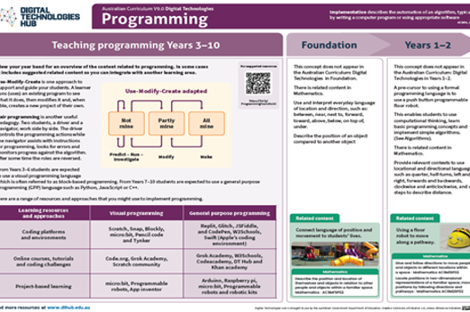
Programming in JavaScript
What is this about?
Students continue to build their skills in JavaScript, a general-purpose programming language. Using JavaScript, students can implement algorithms as programs organised with functions, and can use data structures such as arrays (also called lists).
Many development environments for JavaScript provide debugging tools, allowing students to step through their programs line by line as they run, and query the values of variables.
Content description
Design algorithms involving logical operators and represent them as flowcharts and pseudocode AC9TDI10P05
Validate algorithms and programs by comparing their output against a range of test cases AC9TDI10P06
Implement, modify and debug modular programs, applying selected algorithms and data structures, including in an object-oriented programming language AC9TDI10P09
This sequence enables students to:
- write and test code in JavaScript, organising their code with functions
- understand and use data structures such as arrays
- (if possible) use debugging tools in their JavaScript development environment.
Supplementary information
A common application of JavaScript is in web development, where webpage elements (images, text and links) can serve as a graphical user interface (GUI) for JavaScript. This particular application is explored in the final topic of the Webpage design unit.
Resources to include
Resources to introduce

Years 9–10 JS Hero
Refresh or reintroduce JavaScript knowledge by working through a series of plain, self-marked exercises (no account needed).
Requires
- internet access
- computers or laptops
Suggested time
4 hoursEnables students to:
- apply JavaScript skills and refresh their understanding of syntax
- use a clean, self-marking coding environment without account logins.

Resources to develop and consolidate learning
-
Intro to computer science in JavaScript
Find out more -
Computer science principles
Find out more -
Learn JavaScript
Find out more -
replit.com
Find out more -
Python Tutor
Find out more

Years 9–10 Intro to computer science in JavaScript
Choose this online platform to be able to customise a sequence of modules for your class, including data structure skills.
Requires
- internet access
- computers, laptops or tablets
- free CodeHS accounts
Suggested time
20 hoursEnables students to:
- learn JavaScript programming concepts at their own pace, with a teacher dashboard to monitor progress
- take on more advanced modules with customisation by their teacher.

Years 9–10 Computer science principles
Choose applied coding units from this complete course to learn and practise JavaScript coding skills, including data structures.
Requires
- internet access
- computers, laptops or tablets
- free code.org accounts
Suggested time
20 hoursEnables students to:
- learn JavaScript programming concepts at their own pace, with a teacher dashboard to monitor progress
- alternate between typing code and using blocks
- complete exercises in an interactive, coding environment.
Years 9–10 Learn JavaScript
Choose this online platform to help students catch up on JavaScript skills with a series of self-paced lessons.
Requires
- internet access
- computers or laptops
Suggested time
10 hoursEnables students to:
- describe the JavaScript syntax and develop coding skills
- complete exercises in an interactive, self-marking coding environment.
Years 9–10 replit.com
Use this online environment to write and test JavaScript programs. Note: Selecting 'Node.js' when creating a project allows for a direct JavaScript programming experience. Selecting 'HTML, CSS, JS' starts a project with a webpage development experience.
Requires
- internet access
- computers or laptops
- free replit.com accounts (tied to individual email addresses)
Suggested time
n/aEnables students to:
- write and test JavaScript code in an online integrated development environment (IDE).
Years 9–10 Python Tutor
Despite the name, you can use this online tool to visualise JavaScript code as you run it.
Requires
- internet access
- computers or laptops
Suggested time
n/aEnables students to:
- write JavaScript code then step through line by line
- show visualisations of the variables in their code.
Resources to extend and integrate learning


Years 9–10 DragonScript Arena
Use JavaScript to code AI for a dragon to battle other dragons.
Requires
- internet access
- computers or laptops
- free registration required to create an account
Suggested time
3 hoursEnables students to:
- undertake a series of lessons to familiarise themselves with the environment
- write JavaScript to program a virtual dragon that can fight other dragons.

Years 9–10 Four Corners
Practise using arrays to code JavaScript for a children's game.
Requires
- internet access
- computers or laptops
Suggested time
1 hourEnables students to:
- implement the array data structure
- practise JavaScript coding.

Years 9–10 Minesweeper in JavaScript
Improve a simple Minesweeper game by modifying and adding code.
Requires
- internet access
- computers or laptops
Suggested time
2 hoursEnables students to:
- practise JavaScript coding.
Further reading and professional learning
-
Learn JavaScript on w3schools
Find out more -
Pedagogy 2-pagers and podcasts
Find out more -
Programming infographic: years 7–10
Find out more
Years 9–10 Learn JavaScript on w3schools
Use this free resource to quickly look up JavaScript concepts with straightforward examples.
Suggested time
30 minutes
Years 9–10 Pedagogy 2-pagers and podcasts
Read useful 2-page articles on coding pedagogy, including Worked examples, Live coding and PRIMM. Podcasts also available.
Suggested time
30 minutes
Years 9–10 Programming infographic: years 7–10
Use this infographic as a guide to view ways programming is covered for years 7–10.
Suggested time
30 minutes
Object-oriented programming
What is this about?
Whether using Python, JavaScript or another suitable language, the object-oriented paradigm is a way of organising code that is often considered more natural and effective than simply using isolated functions. This is particularly the case as programs become longer and more complex.
Object-oriented programming (OOP) means defining and using objects that collect together the data and functionality for something in a program, such as a sprite in a video game, or a pet in a veterinary database interface system. An object is defined by writing a class, a section of code that comprises the relevant variables and functions (methods) for that object. Then, instances of an object can be made and used by calling on its class code.
Content description
Design algorithms involving logical operators and represent them as flowcharts and pseudocode AC9TDI10P05
Validate algorithms and programs by comparing their output against a range of test cases AC9TDI10P06
Implement, modify and debug modular programs, applying selected algorithms and data structures, including in an object-oriented programming language AC9TDI10P09
This sequence enables students to:
- explore foundational concepts of object-oriented programming
- write and use their own object definitions (classes) in Python or JavaScript.
Supplementary information
Both Python and JavaScript provide the ability to write object definitions (classes), so both languages are OOP languages. Other such languages include C++, C#, Java, Ruby, Swift and Perl.
Resources to include
Resources to introduce

Years 9–10 Behaving with real class
Use this lesson to introduce object-oriented programming (OOP) with Python code.
Requires
- internet access
- computers, laptops or tablets
- any Python coding environment
Suggested time
2 hoursEnables students to:
- explore the purpose and value of OOP
- code simple programs with object definitions (classes) in Python.
Years 9–10 Alice
Experiment with this 3D environment that implicitly teaches object-oriented concepts with visual block coding, including pre-prepared lessons.
Requires
- computer or laptop
- Alice 3 (must be installed on Windows, Mac or Linux)
Suggested time
5 hoursEnables students to:
- create and add behaviour to a 3D world with animals, furniture and people defined with explicit OOP
- use visual blocks rather than typed code.

Resources to develop and consolidate learning
-
OOP Programming: classes and objects
Find out more -
Object-oriented programming
Find out more -
Intro to computer science in JavaScript
Find out more -
Stopwatch class
Find out more
Years 9–10 OOP Programming: classes and objects
Use this lesson to introduce object-oriented concepts with sample Python programs and a tinkering challenge.
Requires
- internet access
- computers, laptops or tablets
Suggested time
1 hourEnables students to:
- gain a visual representation of how objects are defined
- view and run Python programs that incorporate simple OOP
- try a coding challenge to modify code.
Years 9–10 Object-oriented programming
Use these resources to support students to gain an understanding of the concepts of objects and classes.
Requires
- internet access
- computers, laptops or tablets
- teacher free login and registration to download resources
Suggested time
5 hoursEnables students to:
- describe the relationship between a class and an object
- model a real-world problem using OOP conventions
- define attributes and methods as a part of a class.
Years 9–10 Intro to computer science in JavaScript
Already referenced in the JavaScript topic, this online course includes objects as part of its data structures concepts and skills.
Requires
- internet access
- computers, laptops or tablets
- free CodeHS accounts
Suggested time
20 hoursEnables students to:
- learn objects as part of a larger JavaScript course.
Years 9–10 Stopwatch class
Use this lesson to create and use a class to define a stopwatch object in JavaScript.
Requires
- internet access
- computers, laptops or tablets
Suggested time
1 hourEnables students to:
- build a JavaScript program that incorporates foundational object-oriented concepts
- try a coding challenge to modify code.
Resources to extend and integrate learning
-
Object-oriented programming concepts
Find out more -
Object-oriented programming crossword
Find out more

Years 9–10 Object-oriented programming concepts
Use this webpage to reference specific, intermediate-to-advanced object-oriented concepts.
Requires
- internet access
- computers, laptops or tablets
Suggested time
n/aEnables students to:
- refer to OOP concepts with pseudocode examples.

Years 9–10 Object-oriented programming crossword
Use this interactive to test student knowledge of intermediate-to-advanced object-oriented vocabulary and concepts.
Requires
- internet access
- computers or laptops
Suggested time
45 minutesEnables students to:
- test their knowledge of OOP vocabulary and concepts.

Further reading and professional learning
-
Object-oriented programming (OOP)
Find out more -
Object-oriented programming for Australian teachers
Find out more -
Programming infographic: Years 7–10
Find out more -
Object-oriented programming and classes
Find out more
Years 9–10 Object-oriented programming (OOP)
This comprehensive online guide, explores ways the OOP method of programming (or paradigm) is different to the procedural paradigm, which many programmers start out with on their learning journey.
Suggested time
30 minutes
Years 9–10 Object-oriented programming for Australian teachers
Use this online course with slow-paced video tutorials to learn the basics of OOP in Python and/or JavaScript.
Suggested time
30 minutes
Years 9–10 Programming infographic: Years 7–10
Use this infographic as a guide to view ways programming is covered for years 7–10.
Suggested time
30 minutes
Years 9–10 Object-oriented programming and classes
This article provides a condensed introduction to OOP with Python code examples.
Suggested time
5 hours
Student-driven project
Overview
Students take responsibility for selecting and managing a collaborative project to design and develop a digital product or prototype. This digital product could include creating a software application, an app, a game, a coded robotic device or a wearable device.
In this project, students apply their data skills to gather and analyse information that informs the definition and design of the solution. They also apply programming skills to create the digital solution.
The units follow a structured approach, supporting either a design thinking framework or a problem-solving framework.
Unit 1: Understanding the design challenge and users
Unit 2: Ideate, plan and develop
Unit 3: Prototype and iterate
Unit 4: Evaluate and refine
Teachers can choose the design thinking model (Empathise, Define, Ideate, Prototype and Test) or the EDGE framework (Explore, Develop, Generate, and Evaluate) for problem-solving. Both approaches support the creation of a successful digital solution focusing on the user.
It is critical that students are well guided and facilitated by the teacher to ensure their chosen project’s topic scope and scale are appropriate for the time constraint and their abilities.
Project management is a key component, with students applying agile principles, such as frequent iteration based on user feedback. Tools suggested include visual task lists, Kanban boards or Scrum backlogs. For highly predictable work, students could use project planning and tracking tools such as Gantt charts.
Estimation of effort, often referred to as ‘task sizing’, is an important part of project management that helps teams plan and track their progress effectively. This approach involves estimating the amount of effort based on t-shirt sizing, for example, small, medium, large based on complexity or time required. Each part of the work is given a number of ‘story points’. These story points describe the level of effort required to develop the solution for each user story. Story points would then allow students to construct a burndown chart to keep their project on track and to identify any changing priorities.
Achievement standards
By the end of Year 10 students develop and modify innovative digital solutions, decompose real-world problems, and critically evaluate alternative solutions against stakeholder elicited user stories. They design and validate algorithms and implement them, including in an object-oriented programming language. They use advanced features of digital tools to create interactive content, and to plan, collaborate on, and manage agile projects.
Australian Curriculum
Content descriptions
Investigating and defining AC9TDI10P04
Generating and designing AC9TDI10P07, AC9TDI10P08
Evaluating AC9TDI10P10
Collaborating and managing AC9TDI10P11, AC9TDI10P12
Additionally these content descriptions may be covered:
Generating and designing AC9TDI10P05, AC9TDI10P06
Producing and implementing AC9TDI10P09
Acquiring, managing and analysing data AC9TDI10P01, AC9TDI10P02, AC9TDI10P03
Privacy and security AC9TDI10P14
Related content and General Capabilities
Digital Literacy: Creating and exchanging, Managing and operating
Critical and Creative Thinking
This topic enables students to
- learn agile project management principles and tools, applying them to a collaborative project
- develop and utilise user stories and design criteria
- apply skills in acquiring and analysing data as part of the design process
- learn and apply principles of effective user experience and user interface design
- apply programming skills to develop and test the solution
- evaluate the solution and the success of project management.
Supplementary information
Students may benefit from taking on a ‘client’ – a real or hypothetical person or organisation with a problem or opportunity to address. Teachers should work with students to refine their project idea in the earliest stage. This can ensure no groups have exactly the same idea or inappropriate ideas. To help students stay on track, teachers are encouraged to use formal documents and procedures for tracking and observing student progress in their projects, as well as negotiating or specifying milestone deadlines.
Students may produce a proof of concept or prototype rather than a finished solution. Teachers are encouraged to assess students on each stage of the design process (or problem-solving phase).
Assessment View assessment advice
Use this rubric as a starting point for assessment of designing a digital solution process and the demonstrated project management skills used to monitor and successfully deliver the project.
Rubric based on Queensland Curriculum and Assessment Authority Years 9–10 standard elaborations — Australian Curriculum v9.0: Digital Technologies.
Use this project reflection to enable students to reflect on their project and evaluate its success, learn from their experiences, and identify ways to improve in the future.
| Investigating and defining | writes statements about real-world problems | partial decomposition of real-world problems | decomposition of real-world problems | effective decomposition of real-world problems |
| Generating and designing | with guidance, designs basic components of a solution with limited use of user-centred approaches. Directed design and/or validation of algorithms | designs a solution with basic functionality, referencing simple user stories or stakeholder input. Guided design and validation of algorithms | designs a solution that meets requirements, integrating user stories and stakeholder feedback effectively. Design and validation of algorithms | designs an innovative solution clearly meeting requirements, incorporating detailed user stories and comprehensive stakeholder input meeting acceptance criteria. Effective design and validation of algorithms |
| Producing and implementing | directed implementation of algorithms | partial implementation of algorithms, or use of non-text-based programming language in implementation | implementation of algorithms using a general-purpose programming language | effective implementation of algorithms using a general-purpose programming language |
| Collaborating and managing | directed use of digital tools for project management and collaboration | variable use of advanced features of digital tools to partially create interactive content and partially plan, collaborate on or manage agile projects | use of advanced features of digital tools to create interactive content and plan, collaborate on and manage agile projects | effective use of advanced features of digital tools to create interactive content and plan, collaborate on and manage agile projects |
| Evaluating | identification of alternative solutions against stakeholder elicited user stories | partial evaluation of alternative solutions against stakeholder elicited user stories | critical evaluation of alternative solutions against stakeholder elicited user stories | effective critical evaluation of alternative solutions against stakeholder elicited user stories |
Unit sequence
This topic offers 4 sequential units
Unit 1
Understanding the design challenge and users
Establish collaborative teams, explore the problem, identify user needs, and define clear goals.Unit 2
Ideate, plan and develop
Brainstorm design ideas, select preferred design and plan the solution, developing algorithms and considering user interface (UI) and user experience (UX).Unit 3
Prototype and iterate
Create testable models in the form of a prototype and gather feedback to improve.Unit 4
Evaluate and refine
Assess the solution's effectiveness and make enhancements to meet user needs.Understanding the design challenge and users
What is this about?
At this stage of the project, students form collaborative teams to identify and define a need or opportunity for a digital solution. Consider group formation and what combination of students per team is most relevant, for example; friendship groups, groups with diverse skills and interests, or random selection.
A design methodology informed by agile principles begins with empathising with the user. Through interviewing a ‘client’ and other potential stakeholders, student teams develop user stories to understand the need or opportunity. Further insight is gained through acquiring and analysing relevant primary data, such as from a survey, and secondary data, such as from online data repositories.
The problem or opportunity can then be framed as a problem statement, with accompanying design criteria to guide the solution. The problem statement needs to identify a ‘gap’, or a problem that has yet to be solved. It should seek to create a solution to the problem or solve the problem in a new way. An analysis could be undertaken based on how existing designs meet or do not meet the user's needs and wants.
In the EDGE framework, this first phase is called the Explore phase and involves researching and gathering information about the problem that the digital solution is intended to address. This typically includes identifying user personas, finding data sources to guide development, and defining criteria for success.
Students apply project management techniques and tools to conduct, document and organise meetings, and to plan the project timeline at a high level, including identifying potential risks.
Content descriptions
Define and decompose real-world problems with design criteria and by interviewing stakeholders to create user stories AC9TDI10P04
Use simple project management tools to plan and manage individual and collaborative agile projects, accounting for risks and responsibilities AC9TDI10P12
Data related content descriptions:
Develop techniques to acquire, store and validate data from a range of sources using software, including spreadsheets and databases AC9TDI10P01
Analyse and visualise data interactively using a range of software, including spreadsheets and databases, to draw conclusions and make predictions by identifying trends and outliers AC9TDI10P02
Model and query entities and their relationships using structured data AC9TDI10P03
Apply the Australian Privacy Principles to critique and manage the digital footprint that existing systems and student solutions collect AC9TDI10P14
This sequence enables students to:
- familiarise themselves with a design methodology or problem-solving framework that will be used to guide the design and creation of a digital solution
- create user stories, user personas, a problem statement and design criteria for a solution
- acquire and analyse relevant primary and secondary data
- learn and apply agile principles and tools relevant to this stage of the project
- employ project management techniques and tools relevant to this stage of the project.
Resources to include
Resources to introduce
-
Design thinking and collaborative tools
Find out more -
Get started with design thinking
Find out more -
Developing with EDGE
Find out more -
The EDGE problem solving process
Find out more -
MindMup
Find out more -
What is agile – an overview
Find out more -
Agile user stories
Find out more -
User persona template
Find out more -
Canva user persona templates
Find out more


Years 9–10 Design thinking and collaborative tools
Use this set of slides to introduce the project and some appropriate collaborative tools.
Requires
- internet access
- computer and large screen for class display
Suggested time
20 minutesEnables students to:
- gain an overview of the tasks and tools relevant to starting a design project
- explore and discuss user stories and user interviews.

Years 9–10 Get started with design thinking
Refer to this diagram of the Stanford d.school's popular design thinking methodology.
Requires
- internet access
- computer and large screen for class display
Suggested time
10 minutesEnables students to:
- gain an understanding of design thinking methodology.
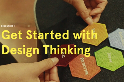
Years 9–10 Developing with EDGE
EDGE is a problem-solving process or framework that provides guidelines in creating digital solutions that are well-designed, effective, and sustainable.
Requires
- internet access
- computer and large screen for class display
- a visitor log-in to enable users to view examples
Suggested time
30 minutesEnables students to:
- gain an understanding of a four-stage problem-solving process
- explain how they could apply this process to their design challenge.

Years 9–10 The EDGE problem solving process
This video provides a guide to the EDGE Model for problem-solving.
Requires
- internet access
- computer and large screen for class display
Suggested time
14 minutesEnables students to:
- gain an understanding of a four-stage problem-solving process
- explain how they could apply this process to their design challenge.

Years 9–10 MindMup
Use this digital tool to explore the problem and its context.
Requires
- internet access
- computers, laptops or tablets
- access to MindMup (free registration)
Suggested time
1 hourEnables students to:
- visually represent connections between different aspects of a design context.
Years 9–10 What is agile – an overview
Watch this video for a brief introduction to agile principles and popular practices such as Scrum and Kanban.
Requires
- internet access
- computer and large screen for class display
Suggested time
10 minutesEnables students to:
- gain an introductory understanding of the agile principles and their rationale
- survey popular agile practices for teamwork, such as Scrum and Kanban.
Years 9–10 Agile user stories
Watch this video to see example user stories and learn how user stories apply to agile project management.
Requires
- internet access
- computer and large screen for class display
Suggested time
30 minutesEnables students to:
- see examples of user stories in the context of software development, but applicable to data investigations - another digital solution
- explore how user stories apply to agile project management.
Years 9–10 User persona template
Use the user persona template to capture important information about your target audience. Create user personas to gain insight into customer needs and build better products.
Requires
- internet access
- computers, laptops or tablets
- access to Miro (free registration)
Suggested time
1 hourEnables students to:
- use a template to guide development of a user persona
- collaborate as a team to refine their user persona.

Years 9–10 Canva user persona templates
Browse the user persona examples and modify to suit the design challenge.
Requires
- internet access
- computers, laptops or tablets
- access to Canva (free registration)
Suggested time
1 hourEnables students to:
- use a template to guide development of a user persona
- collaborate as a team to refine their user persona.
Resources to develop and consolidate learning
-
A taste of agile
Find out more -
The design process: user centred design
Find out more -
Kaggle
Find out more -
Google dataset search
Find out more -
Effectively summarising with generative AI
Find out more -
Microsoft Planner
Find out more -
GanttProject
Find out more -
Mural
Find out more


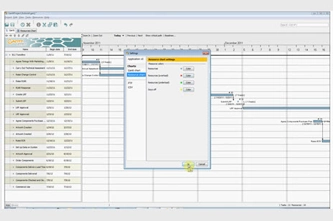

Years 9–10 A taste of agile
Use this self-paced sequence found in the agile Explorer course to discover the values, principles and practices of the agile methodology.
Requires
- internet access
- computers, laptops or tablets
- IBM SkillsBuild account (free registration)
Suggested time
2 hoursEnables students to:
- gain a simple introduction to the why and how of agile
- explore agile practices such as social contracts, ‘wall of work’ and stand-ups.

Years 9–10 The design process: user centred design
Use Chapter 1 of this online course to explore and practise user-centred design in the context of a mobile app.
Requires
- internet access
- computers, laptops or tablets
- Free code.org accounts
Suggested time
8 hoursEnables students to:
- learn and apply user-centred design through a series of lessons.

Years 9–10 Kaggle
Use this website to find online datasets for many different topics.
Requires
- internet access
- computers, laptops or tablets
Suggested time
30 minutesEnables students to:
- find and download secondary data sets to analyse as part of defining their project’s problem or opportunity.
Years 9–10 Google dataset search
Use this website to find online datasets for many different topics
Requires
- internet access
- computers, laptops or tablets
Suggested time
30 minutesEnables students to:
- find and download secondary data sets to analyse as part of defining their project’s problem or opportunity.
Years 9–10 Effectively summarising with generative AI
Use this article for tips on how AI tools like ChatGPT and Copilot can help in summarising discussions and research.
Requires
- internet access
- computers, laptops or tablets
Suggested time
60 minutesEnables students to:
- use generative AI tools effectively and carefully when summarising discussions and research.
Years 9–10 Microsoft Planner
Use this tool to create and maintain a Gantt chart, a traditional approach for planning that can be used effectively alongside other practices.
Requires
- computers or laptops
- Microsoft Planner may be available to your school as part of a Microsoft suite. Excel can also be used to create basic Gantt charts.
Suggested time
60 minutesEnables students to:
- create and maintain a Gantt chart to plan a full project at a high level
- optionally, use the Gantt chart for whole-project planning, in conjunction with agile approaches for week-to-week management of work.
Years 9–10 GanttProject
Use this offline tool for a simple and free alternative to Microsoft Project.
Requires
- computers or laptops
- GanttProject needs to be installed on Windows, Mac or Linux
Suggested time
60 minutesEnables students to:
- create and maintain a Gantt chart to plan a full project at a high level
- optionally, use the Gantt chart for whole-project planning, in conjunction with agile approaches for week-to-week management of work.
Years 9–10 Mural
This collaboration tool enables efficient and productive teamwork.
Requires
- computers or laptops
- access to Mural website (free registration)
Suggested time
60 minutesEnables students to:
- use generative AI tools effectively and carefully when collaborating and sharing ideas.
Resources to extend and integrate learning

Years 9–10 Design thinking course
Use this course along with unplugged resources to explore and apply design thinking steps.
Requires
- internet access
- computers, laptops or tablets
- Grok Academy account (free registration)
Suggested time
5 hoursEnables students to:
- learn and apply design thinking concepts through online exercises and unplugged activities.

Years 9–10 The Double Diamond
Refer to this article to discover the Design Council's Double Diamond, a way of describing the flow of a design process.
Requires
- internet access
- computers, laptops or tablets
Suggested time
30 minutesEnables students to:
- gain a quick overview of the Double Diamond, visualising the flow of a design process.
Further reading and professional learning
-
Creative Technologies Education
Find out more -
What is agile methodology? (A beginner’s guide)
Find out more -
Five structures for helping students learn project management
Find out more -
My product design process
Find out more -
Creative Technologies Education
Find out more


Years 9–10 Creative Technologies Education
Students as designers of digital games.
Suggested time
30 minutes
Years 9–10 What is agile methodology? (A beginner’s guide)
This article introduces the key values and principles of agile.
Suggested time
30 minutes
Years 9–10 Five structures for helping students learn project management
Read this blog post for advice on teaching project management to school-age students.
Suggested time
30 minutes
Years 9–10 My product design process
This video is a walkthrough and reflection on a design process using the Design Council's Double Diamond.
Suggested time
14 minutes
Years 5–6 Creative Technologies Education
Students as designers of digital games
Suggested time
30 minutes
Ideate, plan and develop
What is this about?
At this stage of the project, students working in their collaborative team generate, modify and share design ideas for their digital solution. Encourage students to ‘think outside of the box’ and explore innovative, radical or crazy ideas before selecting and then refining as they work towards a solution.
Beginning with the problem statement and design criteria developed previously, students generate and record design ideas using approaches such as How Might We? questions and a root cause tree diagram. At this point quantity is more important than quality.
Teams work collaboratively to group, compare and prioritise their ideas using tools such as mind maps, ultimately narrowing down to no more than two or three alternative design ideas. Looking for inspiration from different sources, such as nature, art, technology or other industries, is a great way to spark creativity and develop innovative ideas. Prioritise using design criteria against user needs and wants and in consultation with stakeholders, gathering feedback before iterating.
These design ideas are communicated appropriately to the ’client’, with a preferred design ultimately selected for going forward.
If following the EDGE framework, this phase typically involves students designing and building the skeleton of their application. Students create algorithms and data structures for developing a solution that can process and manipulate data effectively. They consider user experiences (UX) and user interfaces (UI).
Project management at this stage involves the team organising their work into discrete tasks that can be grouped under major deliverables. New agile tools for project management include visual taskboards (also called a ‘wall of work’) where the tasks can be assigned and monitored. Students also continue to utilise explicit project management techniques and tools from the previous unit, optionally introducing the use of AI summarisation for their brainstorming recordings.
Estimation of effort, often called ‘task sizing’, is a crucial part of project management that helps teams plan and track their progress effectively. It involves assessing the amount of effort needed to complete a specific task or user story in a project. One popular method for doing this is ‘t-shirt sizing’, where tasks are categorised into sizes such as ‘small’, ‘medium’, and ‘large’, based on their complexity, amount of work, or time required.
Each size is then translated into a numeric value called ‘story points’. Story points represent the relative effort required to complete the task. For example:
- Small might be 1–3 story points (simple and quick tasks).
- Medium could be 4–8 story points (moderately complex tasks).
- Large might be 9–21 story points (tasks requiring significant effort).
These story points help teams prioritise work and plan their time effectively. Once the tasks have been sized and assigned story points, students can use them to create a burndown chart.
A burndown chart is a visual representation of the work remaining in a project versus the time left to complete it. It shows:
- the total number of story points at the start of the project
- the progress over time, as story points are completed
- a projected trend line, which indicates whether the team is on track to finish the project by the deadline.
By updating the chart regularly, teams can spot when priorities are shifting or when progress is slowing. This transparency helps in reallocating resources or adjusting the plan as needed. For students, learning this process is a hands-on way to understand project management tools and how to keep projects running smoothly.
Content descriptions
Design and prototype the user experience of a digital system AC9TDI10P07
Generate, modify, communicate and critically evaluate alternative designs AC9TDI10P08
Use simple project management tools to plan and manage individual and collaborative agile projects, accounting for risks and responsibilities AC9TDI10P12
This sequence enables students to:
- generate design ideas through brainstorming and with specific collaborative tools
- group, prioritise and select design ideas
- learn and apply agile principles and tools relevant to this stage of the project
- employ project management techniques and tools relevant to this stage of the project.
Resources to include
Resources to introduce
Years 9–10 Design sprint case study
Watch this video for an example of an industry team's design process in creating a successful app.
Requires
- internet access
- computers, laptops or tablets
Suggested time
30 minutesEnables students to:
- see the different stages of the design process applied by a team developing an app.

Years 9–10 How scope creep killed my game
Watch this video for a simple example of how scope creep can cause a project to fail to meet its original goals.
Requires
- internet access
- computers, laptops or tablets
Suggested time
10 minutesEnables students to:
- understand the concept of scope creep in a project.
Resources to develop and consolidate learning
-
How Might We (HMW)
Find out more -
Construct a root cause tree
Find out more -
Miro
Find out more -
Burndown chart
Find out more -
How to create a sprint burndown chart in Excel
Find out more -
How to use a burndown chart
Find out more -
Microsoft Whiteboard
Find out more -
Ladder of Feedback
Find out more -
Trello
Find out more -
Notion
Find out more

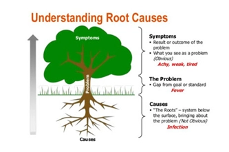
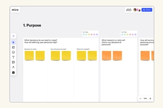
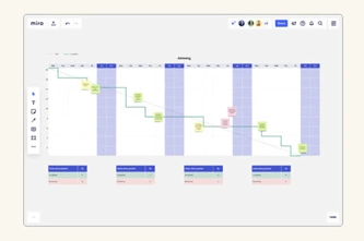

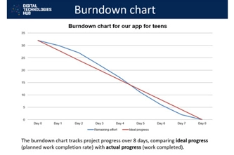
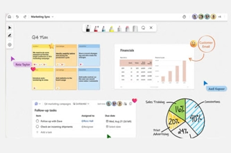
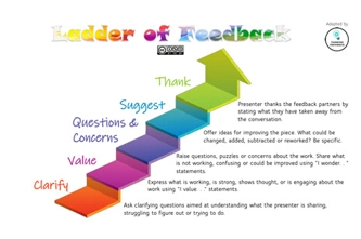

Years 9–10 How Might We (HMW)
Discuss the steps and examples in this article as a class, then practise writing your own How Might We? questions.
Requires
- internet access
- computers, laptops or tablets
Suggested time
30 minutesEnables students to:
- write How Might We questions, which can help set the course for an effective brainstorming session.
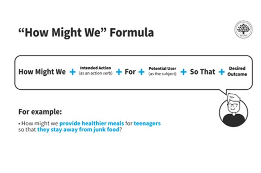
Years 9–10 Construct a root cause tree
Adapt these activities to introduce the root cause tree diagram, a tool that is especially useful for understanding the sources or causes of a problem.
Requires
- paper or digital tools for collaborative brainstorming
Suggested time
1 hourEnables students to:
- use a root cause tree diagram to help analyse the sources or causes of a problem.
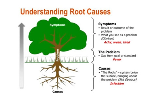
Years 9–10 Miro
Use this online, collaborative tool for brainstorming, mind mapping and other organisation of ideas.
Requires
- internet access
- computers, laptops or tablets
- Miro account for user creating the board (free registration)
Suggested time
1 hourEnables students to:
- work together on a digital whiteboard to make diagrams, plan and brainstorm.
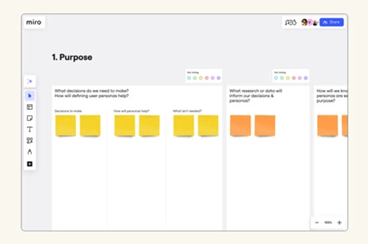
Years 9–10 Burndown chart
Burndown charts are visual graphs that show teams how much work is left to complete and how much time is available to finish the job.
Requires
- internet access
- computers, laptops or tablets
- Miro account for user creating the chart (free registration)
Suggested time
1 hourEnables students to:
- work together on a digital whiteboard to make diagrams, plan and brainstorm
- use a burndown chart to visualise the remaining work against the time available.
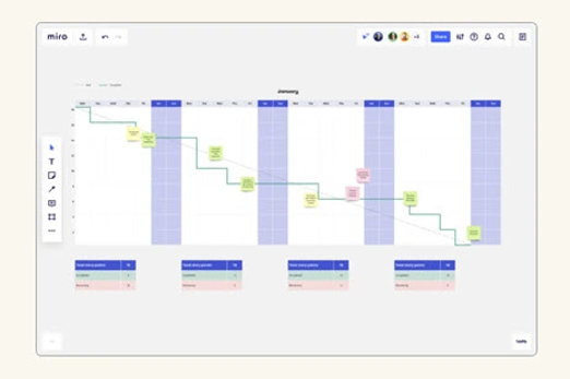
Years 9–10 How to create a sprint burndown chart in Excel
This brief tutorial shows how to construct a 2-week sprint for a burndown chart using Excel.
Requires
- internet access
- computers, laptops or tablets
- access to Excel
Suggested time
12 minutesEnables students to:
- create a burndown chart to visualise the remaining work against the time available.
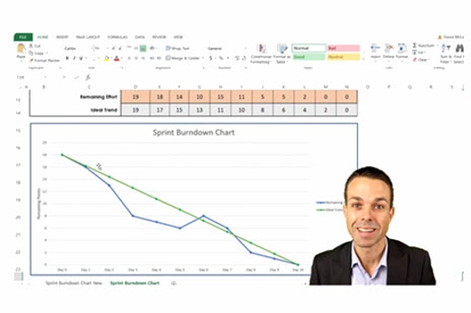
Years 9–10 How to use a burndown chart
Use these teaching slides to introduce burndown charts using a relevant example.
Requires
- internet access
- computer and large screen to view resource as a class
Suggested time
30 minutesEnables students to:
- create a burndown chart to visualise the remaining work against the time available.
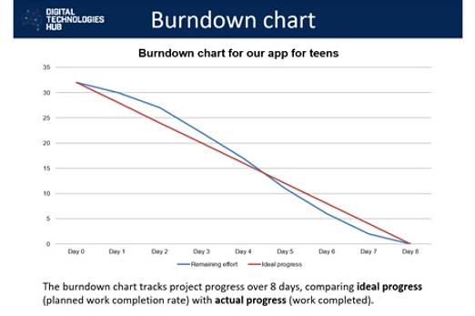
Years 9–10 Microsoft Whiteboard
Schools with Microsoft Whiteboard can use this collaborative tool for brainstorming, mind mapping and other organisation of ideas.
Requires
- computers or laptops
- Microsoft Whiteboard may be available to your school as part of your Microsoft suite.
Suggested time
1 hourEnables students to:
- work together on a digital whiteboard to make diagrams, plan and brainstorm.

Years 9–10 Ladder of Feedback
This routine can be used when seeking feedback on design ideas. It facilitates a structured approach to the feedback process by offering opportunities for clarity, identification of strengths and weaknesses, constructive exploration of concerns, and suggestions for improvement.
Requires
- internet access
- teacher laptop and interactive whiteboard to view resource as a class
Suggested time
45 minutesEnables students to:
- clarify their understanding of peers' perspectives on their app designs
- identify and appreciate the strengths in their app development work
- engage in constructive exploration of areas of concern, while seeking and providing suggestions for improvement in a positive learning environment.

Years 9–10 Trello
Use this online, collaborative tool to create and manage a ‘wall of work’ as part of an agile methodology.
Requires
- internet access
- computers, laptops or tablets
- Trello account for user creating the board (free registration)
Suggested time
1 hourEnables students to:
- create and maintain a board with individual tasks (tickets).
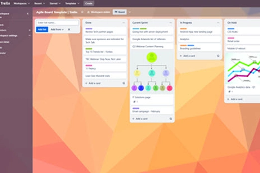
Years 9–10 Notion
Use this online, collaborative tool to create and manage a ‘wall of work’ as part of an agile methodology.
Requires
- internet access
- computers, laptops or tablets
- Notion account for user creating the board (free registration)
Suggested time
1 hourEnables students to:
- create and maintain a board with individual tasks (tickets).
Resources to extend and integrate learning

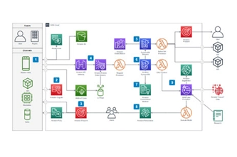
Years 9–10 Scrum vs Kanban – What's the difference?
Watch this introduction to project management using Scrum and Kanban – two methodologies common to the agile approach.
Requires
- internet access
- computer and large screen to view resource as a class
Suggested time
30 minuteEnables students to:
- see how development teams use the Scrum methodology to assign and manage project work
- explore how the Kanban and Scrum methodologies differ.
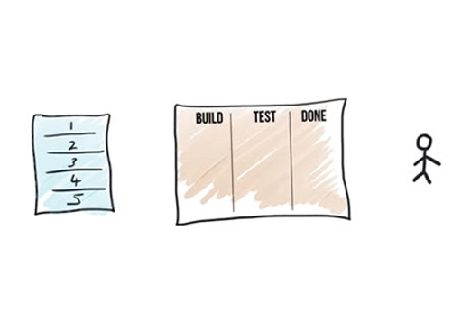
Years 9–10 draw.io
Use this free online tool to draw simple mock-ups and other diagrams that allow collaboration.
Requires
- internet access
- computers, laptops or tablets
Suggested time
1 hourEnables students to:
- use standard symbols to draw simple mock-ups.

Further reading and professional learning
Years 9–10 Affinity diagrams
This article introduces affinity diagrams, an approach for grouping and organising ideas after a brainstorming session.
Suggested time
30 minutes
Prototype and iterate
What is this about?
At this stage of the project, students produce paper-prototype designs, implementing them with code, and then test them with the user.
Importantly, the process of prototype–implement–test is iterative. The team initially produces a prototype for the client, then continues to improve the solution through check-ins with the user(s).
For their design work, students utilise wireframes, mock-ups or other visualisations to formalise and describe the chosen design from the previous stage, incorporating user experience design principles. They also utilise programming design tools, such as pseudocode or flowcharts, for core functionality.
Students apply programming skills to implement and test the solution. They may choose to explore tools, such as source control, for collaborative software development. Implementation also includes making any physical aspects of the solution. If possible, students should use a language like Python or JavaScript for the programming of their software.
This phase of the EDGE problem-solving framework also focuses on prototyping and in addition emphasises code annotation, where comments and notes are added to code to document its utility and effectiveness. This builds an understanding of the code, making it easier to modify, update or potentially fix in the future.
Collaborative teams continue to utilise project management techniques and tools used in earlier phases.
Content descriptions
Design and prototype the user experience of a digital system AC9TDI10P07
Generate, modify, communicate and critically evaluate alternative designs AC9TDI10P08
Evaluate existing and student solutions against the design criteria, user stories, possible future impact and opportunities for enterprise AC9TDI10P10
Use simple project management tools to plan and manage individual and collaborative agile projects, accounting for risks and responsibilities AC9TDI10P12
Programming related content descriptions:
Design algorithms involving logical operators and represent them as flowcharts and pseudocode AC9TDI10P05
Validate algorithms and programs by comparing their output against a range of test cases AC9TDI10P06
Implement, modify and debug modular programs, applying selected algorithms and data structures, including in an object-oriented programming language AC9TDI10P09
This sequence enables students to:
- practise an iterative, agile approach to developing their solution
- use appropriate tools to formalise and describe designs
- apply programming skills to the implementation and testing of designs
- employ project management techniques and tools relevant to this stage of the project.
Resources to include
Resources to introduce

Years 9–10 Wireframes vs. mock-ups vs. prototypes
Use this short video to start a discussion on these three methods of visualising and communicating a design.
Requires
- internet access
- computers, laptops or tablets
Suggested time
10 minutesEnables students to:
- discuss some of the differences between wireframes, mock-ups and prototypes
- discuss the purpose of each of these methods when designing a user experience.
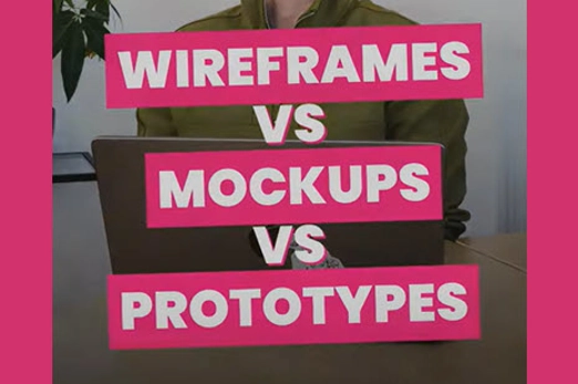
Years 9–10 Agile Manifesto
Show this image to remind students of the 4 values and 12 principles of the agile approach.
Requires
- internet access
- computer and large screen to view resource as a class
Suggested time
10 minutesEnables students to:
- understand the 4 values and 12 principles of the agile approach to creating a solution

Resources to develop and consolidate learning
-
UX/UI Design course
Find out more -
Solution interview
Find out more -
Feedback capture grid
Find out more -
Human computer interaction: Heuristics
Find out more -
Figma
Find out more -
draw.io
Find out more -
Coding for GUIs course
Find out more -
Trello
Find out more -
Notion
Find out more


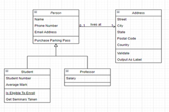
Years 9–10 UX/UI Design course
Use this course along with unplugged resources to practise key tools for user interface design in the context of a mobile app.
Requires
- internet access
- computers, laptops or tablets
- Grok learning account (free registration)
Suggested time
3 hoursEnables students to:
- use design tools to prototype and design mobile interfaces.

Years 9–10 Solution interview
Use this template to support students in testing their app designs, especially when working with prototypes. The main aim is to assess user acceptance of the solutions developed. Students can use the interview analysis to refine and optimise their app designs.
Requires
- printed worksheet
Suggested time
45 minutesEnables students to:
- plan and conduct structured interviews to test their prototypes
- gather feedback on the acceptance and effectiveness of their solutions
- gain real-world insights into user perspectives, preferences and potential challenges.

Years 9–10 Feedback capture grid
This tool helps students test ideas using prototypes. It provides a simple way to document test results. The tool is particularly valuable in assessing how effectively an idea addresses an identified user problem.
Requires
- printed worksheet
Suggested time
45 minutesEnables students to:
- document and organise test results for app prototypes in a simplified format
- assess app ideas
- systematically capture and analyse feedback.
Years 9–10 Human computer interaction: Heuristics
Use this lesson and the linked activities to connect a set of 10 heuristics to user interface design.
Requires
- internet access
- computers, laptops or tablets
- printable document (available at link)
Suggested time
1 hourEnables students to:
- see how Jakob Nielsen’s 10 heuristics and apply to user experience.
Years 9–10 Figma
Use this online tool to prototype with wireframes collaboratively and add limited ‘no-code’ functionality.
Requires
- internet access
- computers, laptops or tablets
- Figma account (free registration)
Suggested time
N/AEnables students to:
- collaborate to create prototype wireframes for their solution’s user interface
- add some simple functionality for an interactive prototype.
Years 9–10 draw.io
Use this free online tool to draw wireframes and flowcharts, also allowing collaboration.
Requires
- internet access
- computers, laptops or tablets
Suggested time
N/AEnables students to:
- use standard symbols to draw wireframes and flowcharts. Note: common software like Microsoft PowerPoint and Google Slides can also be used to draw wireframes and flowcharts.
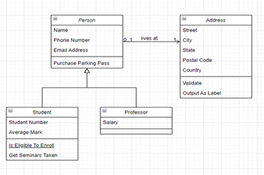
Years 9–10 Coding for GUIs course
Choose this online lesson series to consider principles of graphical user interface (GUI) design, and employ JavaScript programming in the context of a webpage user interface.
Requires
- internet access
- computers, laptops or tablets
Suggested time
12 hoursEnables students to:
- with assistance, program with JavaScript alongside HTML and CSS to make interactive webpages
- learn some basic principles of graphical user interface design.
Years 9–10 Trello
Use this online, collaborative tool to create and manage a ‘wall of work’ as part of an agile methodology.
Requires
- internet access
- computers, laptops or tablets
- Trello account for user creating the board (free registration)
Suggested time
N/AEnables students to:
- create and maintain a board with individual tasks (tickets).
Years 9–10 Notion
Use this online, collaborative tool to create and manage a ‘wall of work’ as part of an agile methodology.
Requires
- internet access
- computers, laptops or tablets
- Notion account for user creating the board (free registration)
Suggested time
N/AEnables students to:
- create and maintain a board with individual tasks (tickets).
Resources to extend and integrate learning
-
FreeSimpleGUI
Find out more -
Python Arcade Library
Find out more -
ursina engine
Find out more -
Microsoft MakeCode for micro:bit
Find out more


Years 9–10 FreeSimpleGUI
Use this library to develop a graphical user interface (GUI) in Python.
Requires
- computers or laptops
- an online Python environment (e.g. replit.com template), or offline Python environment (e.g. Thonny)
Suggested time
N/AEnables students to:
- use extra functions and variables to create a graphical user interface in Python
- avoid some of the more complex base code needed for GUI engines such as Tkinter (Python's standard GUI framework).
Years 9–10 Python Arcade Library
Use this Python library to develop 2D games.
Requires
- computers or laptops
- an offline Python environment (e.g. Thonny)
- tutorials and documentation on the website
Suggested time
N/AEnables students to:
- use extra functions and variables in their python code to make 2D games
- avoid some of the more complex base code needed for engines such as pygame.

Years 9–10 ursina engine
Use this Python library to develop 3D games.
Requires
- computers or laptops
- an offline Python environment (e.g. Thonny)
- tutorials and documentation on the website
Suggested time
N/AEnables students to:
- use extra functions and variables in their Python code to make 3D games
- avoid some of the more complex base code needed for engines like Panda3D.

Years 9–10 Microsoft MakeCode for micro:bit
For robots and other physical computing, the micro:bit device is adaptable, expandable, and can be coded with general purpose languages, not just for lower years.
Requires
- internet access
- computers or laptops
- micro:bits device
Suggested time
N/AEnables students to:
- use a programmable electronic device as the ‘brain’ for a robot or other physical computing project
- code the device in Python or JavaScript/TypeScript.

Further reading and professional learning


Years 9–10 Paper prototyping
This article covers the whys and hows of prototyping user interfaces on paper.
Suggested time
30 minutes
Years 9–10 Top Python game engines
This article provides an overview of popular libraries for Python that allow games to be programmed, including alternatives to the resources for this unit.
Suggested time
30 minutes
Evaluate and refine
What is this about?
At this stage of the project, for both the EDGE framework and design thinking model, students evaluate their solution, consider its impact, and reflect on the project success. It is worth noting that evaluation is cyclic and not intended to be undertaken only at the end of the project.
In design thinking, evaluation includes assessing both the design ideas during development and the final design solution. The solution is evaluated through final feedback from the client, and by critically reviewing the solution against the design criteria and user stories established in the first stage. Students should be encouraged to also consider the broader social impacts of design.
If following the EDGE framework, it is suggested that students make recommendations to improve the solution by proposing changes to code, user interfaces, or the overall solution.
The team prepares a report or presentation discussing possible future impact(s) of the solution. In considering future opportunities, students may prepare an entrepreneurial pitch for the solution, as would be presented to future investors or customers.
Finally, the team reflects on the success of the project management across all four stages. Students may refer to their burndown chart and reflect on the ideal trend compared to their recorded progress and account for any variations or challenges faced.
Content description
Evaluate existing and student solutions against the design criteria, user stories, possible future impact and opportunities for enterprise AC9TDI10P10
Use simple project management tools to plan and manage individual and collaborative agile projects, accounting for risks and responsibilities AC9TDI10P12
This sequence enables students to:
- evaluate their solution against pre-developed design criteria and user stories
- discuss the impact of their solution
- reflect on the success of their project management.
Resources to include
Resources to introduce
-
Evaluation project reflection
Find out more -
Reflection
Find out more -
Ladder of Feedback
Find out more -
10 surprising benefits of digital voting systems
Find out more


Years 9–10 Evaluation project reflection
Use these slides to step through how and why we reflect on the project's success.
Requires
- internet access
- computer and large screen to view resource as a class
Suggested time
1 hourEnables students to:
- follow a process to reflect on and evaluate their design project.

Years 9–10 Reflection
Use this worksheet as a guide to reflect on their group’s approach to design challenge and access the project's success.
Requires
- worksheet
Suggested time
45 minutesEnables students to:
- follow a process to reflect on and evaluate their design project.

Years 9–10 Ladder of Feedback
This routine is a valuable tool for students seeking feedback on their digital solutions. It facilitates a structured approach to the feedback process with opportunities for clarity, identification of strengths and weaknesses, constructive exploration of concerns, and suggestions for improvement.
Requires
- internet access
- computer and large screen to view resource as a class
Suggested time
45 minutesEnables students to:
- clarify their understanding of peers' perspectives on their app designs
- identify and appreciate the positives and strengths in their app development work
- engage in constructive exploration of weaknesses and areas of concern, while actively seeking and providing suggestions for improvement in a positive learning environment.
Years 9–10 10 surprising benefits of digital voting systems
Use this article to discuss impacts of a technological innovation, considering its disadvantages and advantages.
Requires
- internet access
- computer and large screen to view resource as a class
Suggested time
45 minutesEnables students to:
- discuss an example list of impacts of a technology
- critique a one-sided piece by identifying disadvantages.

Resources to develop and consolidate learning
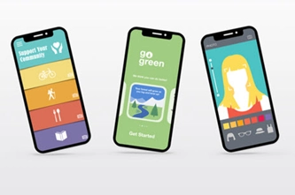
Years 9–10 Create a pitch
This template aids students in sharing the results and insights of their app designs at the end of an iteration or during regular intervals with users. It provides a simple and structured format, guiding students to address the most important questions related to their app development projects.
Requires
- printed worksheet
Suggested time
1 hourEnables students to:
- effectively share the results and insights of their digital solution
- address key questions about their development approach
- discuss feedback received during pitch sessions and suggest improvements.
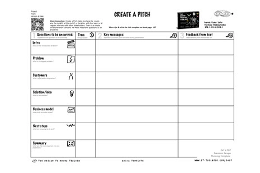
Years 9–10 App showcase guide
This guide supports students in evaluating their digital solutions by providing a celebratory and collaborative environment that gives them opportunity to showcase their problem-solving and coding skills.
Requires
- printed worksheet
Suggested time
1 hourEnables students to:
- present and pitch their app designs to a panel of judges
- celebrate their ingenuity and share their solutions with peers, families and the community
- receive recognition and feedback during the showcase event.

Resources to extend and integrate learning
-
Evaluation considerations
Find out more -
Reflecting with purpose
Find out more -
Burndown chart calculator
Find out more


Years 9–10 Evaluation considerations
This resource designed for Queensland teachers breaks down many elements of evaluation, such as different impacts and components.
Requires
- internet access
- computer
Suggested time
30 minutesEnables students to:
- understand the process of evaluating and impacts of their designed solution.
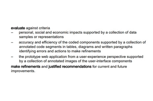
Years 9–10 Reflecting with purpose
This article explains different ways that student reflection can take place as part of project-based learning.
Requires
- internet access
- computer and large screen to view resource as a class
Suggested time
30 minutesEnables students to:
- understand and apply insights by reflecting on the process of project-based learning.

Years 9–10 Burndown chart calculator
Use this burndown chart calculator to monitor and record your team’s progress.
Requires
- internet access
- computer
- access to spreadhseet software such as Excel, Number for iOS or Google Sheets.
Suggested time
30 minutesEnables students to:
- understand how to use the burndown chart calculation to create a burndown chart.
Further reading and professional learning
Years 9–10 Designing a digital solution poster (Years F–10)
View this poster for an explanation of design thinking with relevant examples. The poster is designed to assist in the interpretation and support the implementation of the Australian Curriculum V9.
Suggested time
30 minutes